

Entryway Wall Art: A Lasting First Impression
Guests give this wall about ten seconds, while coats, bags and dogs brush past it all day — immediate, slim and sturdy beats delicate every time.
Key Takeaways
- Dress the wall the door actually faces first; walls beside the door are only supporting walls because arrivals see them in passing at an angle.
- Over a console table, run art to about two-thirds of the table's width with its bottom edge 4 to 6 inches above the tabletop objects it must clear.
- Choose mirror or art by the room's deficit: a dark, tight entry needs the mirror's light and width, while a bright, generous one can spend the wall on character.
- Hang for traffic with slim profiles and two fixings instead of a wire, and prefer canvas or acrylic faces within elbow range of coats and toddlers over glass.
- In a windowless entry give the piece some depth against the wall and light it deliberately with a picture light, console lamp or aimed downlight in a warm tone.
No wall in the house works a stranger shift than the entryway’s. It has about ten seconds to make a first impression on every guest, it is passed a dozen times a day by people carrying bags, keys, coats, and dogs, and it usually has the least space of any wall you own. Entryway art therefore has a particular brief: immediate, durable, and slim enough to survive the traffic. For the browse view, see entryway wall art; this guide covers the console-table composition, the honest mirror-versus-art trade-off, and how to dress an entry that has no furniture at all.
Start with the wall the door actually faces
Stand outside, open your front door, and note where your eye lands. For most homes it is the wall opposite the door, and that wall — not the one beside the door, however convenient it seems — is the entry’s main wall. It receives the full ten seconds of a guest’s arrival attention. The walls beside the door are seen in passing, at an angle, by people turning to close it behind them; they are supporting walls, for smaller and quieter things. If the opposite view is a staircase wall or an open doorway into the living room, the nearest full wall to that sightline inherits the job — and that staircase wall itself is dressed by stairwell wall art for the diagonal wall.
Entryway wall art and the console-table composition
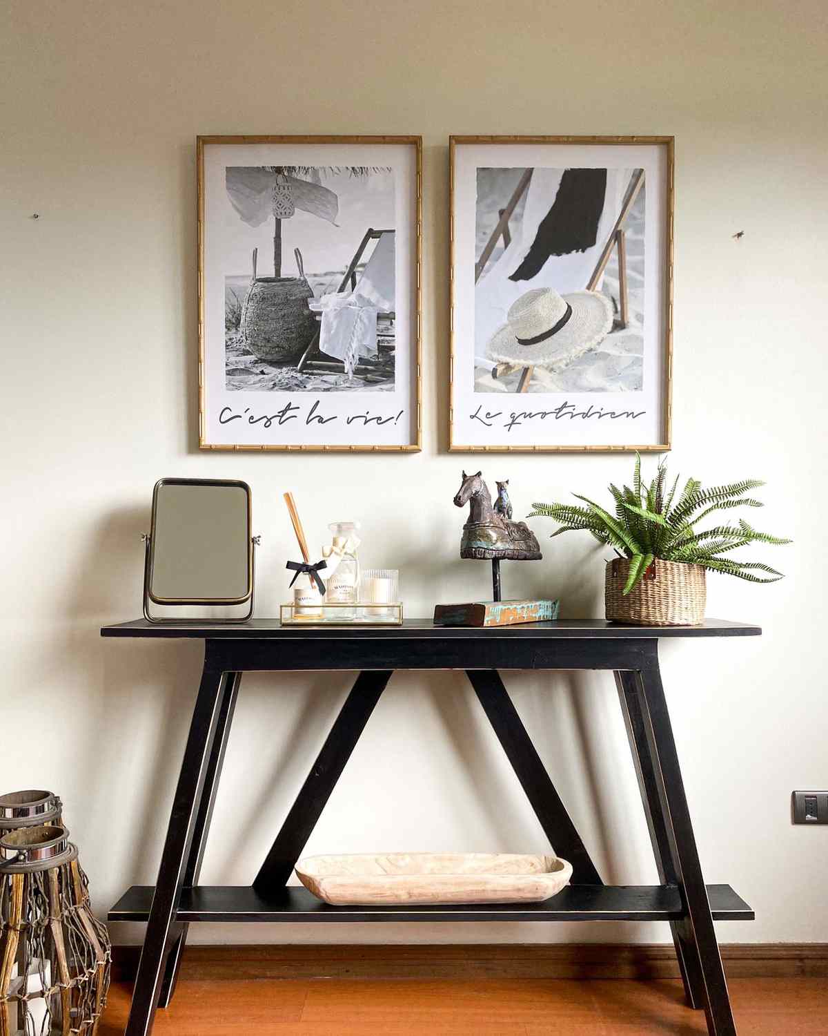
Where there is room for a console table, the entry’s classic arrangement is not a piece of art but a composition: table, art above it, lamp, and one or two useful objects — a bowl for keys, a stack of books, something green. Treat the art as the composition’s top storey. Its width should run about two-thirds of the table’s, its bottom edge 4 to 6 inches above the tabletop objects it must clear, and its palette should shake hands with the lamp and the bowl rather than match them.
Shape is the entry’s secret weapon. Entries are often narrow with ceilings that feel taller by contrast, and vertical wall art plays to exactly that: a tall, slim piece lifts a small entry, fits the wall slices beside doors and coat closets, and reads at a glance from the doorway. A pair of verticals stacked or side by side extends the trick. Where the entry is wide instead — a proper hall — a horizontal landscape over the console calms the space and previews the house beyond it.
Mirror or art? The honest trade-off
Every entryway eventually faces this question, and both answers are respectable. A mirror earns its wall with work: it doubles the light in a usually windowless space, it makes a narrow entry feel wider, and it offers the last-check glance every departing person takes. Art earns its wall with identity: it is the first sentence of the house’s story, the thing that tells a guest whose home this is before a word is spoken.
If you can only have one, choose by the room’s deficit: a dark, tight entry needs the mirror’s light more than it needs a picture; a bright, generous entry can spend its wall on character. If you have two walls, have both — mirror above the console where it is used, art on the facing wall where it is seen — and let each do its own job. The one arrangement to avoid is a small mirror and a small picture side by side in competition; in a ten-second room, one clear gesture beats two hesitant ones.
Built for a traffic zone
Entry art lives where life brushes past, so choose and hang it like it will be bumped — because it will. Slim profiles beat deep, protruding frames in a narrow hall; a gallery-deep piece at shoulder height in a three-foot corridor is a bruise with a hanging wire. Hang entry pieces on two fixings rather than a wire where you can, so a knocked frame settles back level instead of swinging. Glass deserves a thought in tight entries: if a piece will be within elbow range of people wrestling coats and toddlers, canvas or acrylic faces forgive what glazing cannot. And keep the floor zone honest — anything hung above where wet boots and shaking dogs land should have a surface that wipes.
When the entry is also the hallway
In many homes the entry is not a room but the first stretch of a hallway, and the wall runs on past the door toward the bedrooms. That changes the arrangement from a single composition to a procession. The facing wall at the hallway’s end becomes the destination piece — the one seen, growing larger, through the whole approach — and it can carry more scale and more color than a foyer piece because it is viewed for longer and from farther. Along the side walls, hang for a moving viewer: a spaced series of related pieces at consistent height reads as rhythm to someone walking past, where a dense gallery would blur. Keep every piece’s center on one line, keep the frames in one family, and let the gaps be generous; a hallway gallery is read at walking pace, in glances, and it should make sense in glances.
Hallway entries also forgive what foyers cannot: a modest bench, a row of hooks, a runner — each gives the walls partners to compose with. Art above a hook rail should sit high enough to clear coats and hats, and pieces over a bench should expect to be sat against, bags and all; choose surfaces and fixings accordingly.
Light in a room that rarely has a window
Entries are the darkest rooms in most houses, and art chosen in a bright shop can arrive home and disappear. Pale walls and light-toned art vanish together under a single ceiling bulb; the fixes are contrast and light of your own. Give the main piece a palette with some depth against the wall, or a frame that draws its outline. Then light it deliberately: a picture light over the main piece, a lamp on the console washing upward, or a downlight aimed at the wall turns the ten seconds from murk to welcome. Warm bulb tones flatter both guests and art; the blue-white of a bargain LED will make the prettiest piece look like evidence.
No console, no problem
Many entries are a door, a mat, and a stretch of wall in a corridor too narrow for furniture. The composition shrinks to a single gesture, and it should be an unhesitating one: one tall vertical piece on the facing wall, hung with its center near eye level, large enough to read from the threshold. A picture ledge is the narrow entry’s other friend — a few inches deep, it holds a rotating pair of small pieces and the occasional treasure, and changing the display takes a minute — the styling itself is covered in picture ledge styling for shelves that let art lean. What a furnitureless entry cannot carry is a scattered cluster of small frames; without a table to anchor them, small pieces read as clutter at exactly the moment the house should read as composed.
Entryway wall art subjects that say welcome
The entry is the house’s overture, and its subject sets the key for everything after it. Landscapes with a path or a shoreline give arrivals a small sense of journey’s end. Abstracts in the home’s own palette preview the rooms to come, and the largest of them is planned in the complete guide to living room wall art. Subjects with personal geography — the coastline of a hometown, the skyline of a city the household loves — turn the ten seconds into a sentence about the people who live here, which no decorative piece, however pretty, can manage. When you are ready to look, browse wall art by room, subject, and shape with your entry’s measurements in hand — in this room more than any other, the right size in the right shape is most of the battle.
Dress the wall the door faces, build the console composition if you have the table, be honest about mirror versus art, hang all your entryway wall art for the traffic it will meet — and the hardest-working wall in the house will make its ten seconds count.
More in Room Guides
Continue exploring: Room Guides guides · All guides