

How-To: Sizing, Hanging & Arranging
Picture Ledge Styling: Layer, Lean, Rotate
A ledge lets you rearrange in seconds, which is both its charm and its trap. A little layering discipline keeps it looking composed instead of stored.
Key Takeaways
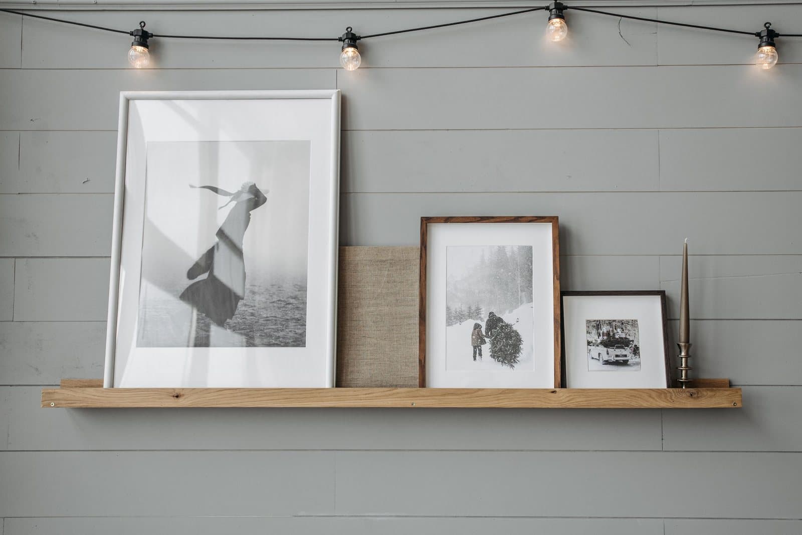
- Layer by height: put the tallest piece at the back, usually off-center, medium pieces flanking it, and small pieces in front overlapping the larger ones by roughly a third of their width, no more than two pieces deep.
- Choose the ledge by depth first: most run about 3.5 to 4.5 inches deep with a front lip an inch or so high, and deep-box frames and ledges under 3 inches are a poor match.
- Leave roughly a fifth of the ledge's length empty so the group has an edge and the next find has somewhere to land without a full restyle.
- Mix frames freely since the shelf supplies the unity, keep the largest piece around twice the height of the smallest, and add just one non-frame item — books, a small plant, or a ceramic object — as seasoning.
- Space stacked ledges for the tallest piece below plus its lean: for a tallest piece of 20 inches, allow about 24 inches between shelves, and mount the ledge into studs where the wall allows.
Picture ledge styling is the most forgiving way to put art on a wall ever devised. Instead of committing each piece to its own hole and its own level-check, you mount one narrow shelf — typically only a few inches deep, with a small lip at the front edge — and then simply lean your frames against the wall on it. Rearranging takes seconds, nothing needs patching when you change your mind, and the arrangement can evolve with your taste, your seasons, and your collection. That freedom, though, is exactly why ledges go wrong: a hung picture makes its one decision and keeps it, while a ledge invites endless casual additions until it looks like a mantel at a yard sale. Styled with a little discipline, a ledge is the most alive surface in a room. Here is the discipline.
Picture ledge styling starts with the ledge itself
Styling starts one decision earlier, with the shelf. Depth is the governing dimension: most picture ledges run about 3.5 to 4.5 inches deep, with a front lip an inch or so high — deep enough for a leaning frame’s foot and the lean itself, shallow enough that the shelf disappears under the art it carries. A frame leans back against the wall at a slight angle, so allow its thickness plus an inch of grace when you judge whether a chunkier frame will sit safely; deep-box frames and ledges under 3 inches are a poor match and should not be talked into each other. Length follows the wall and the furniture rule from hung art: a ledge above a sofa wants to run at something like the sofa’s own width or a little less, so the shelf reads as part of the seating arrangement rather than an unrelated line floating nearby. Material and finish are the ledge’s one chance to speak: match the room’s dominant wood or metal note, or paint the ledge the wall color and let it vanish — vanishing is usually right, since the ledge is a stage and stages are not the play. That two-thirds length comes from the same math as sizing art over furniture.
Layer by height: tall at the back, small in front
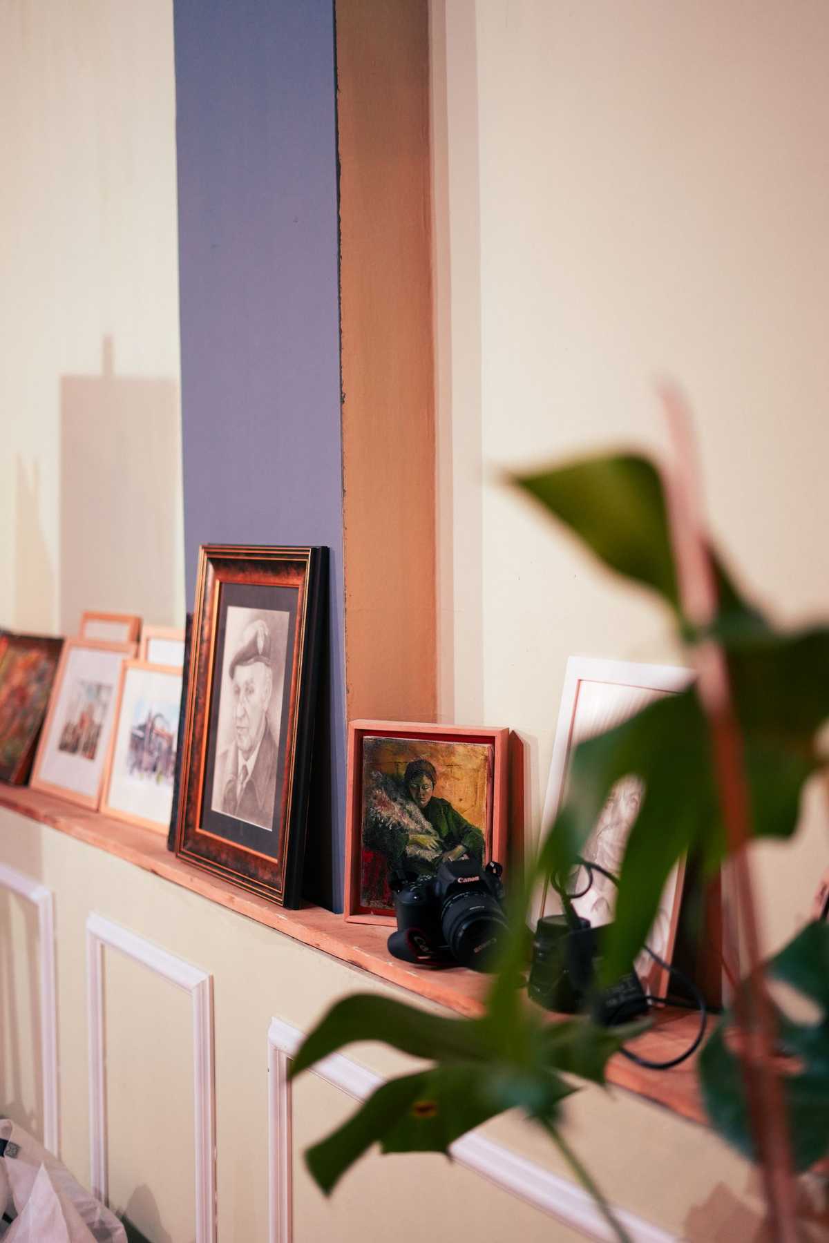
Leaning art naturally happens in two rows — pieces resting fully on the ledge at the back, and smaller pieces in front, overlapping them. Work with that structure instead of pretending it is one row. Put the tallest piece at the back, usually off-center rather than parked in the middle, and let it set the arrangement’s ceiling. Medium pieces flank it, and small pieces come forward, overlapping the larger ones by roughly a third of their width. Overlap is not sloppiness — it is what makes a ledge read as one composed group instead of a lineup. Keep the layering to two pieces deep at any point; a third layer stops looking curated and starts looking stored.
Within that structure, odd numbers compose more easily than even ones: groups of three or five pieces find a balance without the see-saw symmetry pairs create. Vary the heights as you go — a ledge where every frame tops out at the same line reads as a shelf of products, while a rising-and-falling rhythm of tall, medium, and small feels like a collection that grew with intention. The balance rules are cousins of arranging a gallery wall, with one shared line and weight placed low and central.
Mix frames, then add one thing that is not a frame
A ledge tolerates mixed frames better than any wall arrangement, because the shelf itself supplies the unity: black beside natural wood beside a slim metal frame reads as eclectic rather than chaotic when all of them lean on the same line. Mixed sizes matter more than mixed finishes — hold a rough ratio, with the largest piece around twice the height of the smallest, and the group stays coherent. Then break the pattern once. A small stack of art books, a tiny plant, a ceramic object, a clock: one non-frame item keeps a ledge from looking like a frame shop display and turns it into a surface of the room. One is the operative number — the ledge is for art first, and objects are seasoning.
Picture ledge styling: leave some of the ledge empty
The most common ledge mistake is coverage: frames marched from end to end because the shelf is there. Empty ledge is not wasted ledge. Leaving a stretch of bare shelf — roughly a fifth of the length is a good instinct — gives the group an edge, creates the pause that lets each piece be seen, and leaves somewhere for the next find to land without a full restyle. If your ledge runs above a sofa in the living room, think of the arrangement as occupying the middle of the shelf, with calm on either side, the same breathing-room logic that governs a hung composition.
Placement: heights and stacks
A single ledge above furniture follows the furniture: mount it so the shelf sits a few inches above the back of the sofa or the top of a console, keeping the leaning pieces visually attached to what is below them rather than floating in the wall’s upper half. On an open wall, place the ledge so the center of the arrangement it will hold lands around eye level. Stacked ledges — two or three in a column — need vertical arithmetic: the shelf above must clear the tallest piece below plus its lean. For a tallest piece of 20 inches, allow about 24 inches between shelves, which covers the lean angle and leaves fingers room to lift pieces in and out. Measure your tallest intended frame first and let it set the spacing; retrofitting taller art into short spacing is how ledges end up holding only small pieces forever.
What leans well, and what would rather hang
Not every piece is a natural leaner. Light, unglazed pieces — canvas, prints on board, unframed works on paper in slim frames — sit happily on a ledge, easy to swap and forgiving if nudged. Heavy, glass-fronted frames are the awkward guests: their weight concentrates on a thin bottom edge, the glass is one tip away from a bad afternoon, and sliding them along the shelf risks the wall behind. Deep shadow-box frames need the shelf depth checked first, as above. And anything leaning should lean as a group member, not a cliff edge: keep the front pieces’ feet behind the lip with room to spare, and if a piece only balances at the very front of the shelf, it is telling you it belongs on a hook instead. The ledge’s charm is that it makes these judgments cheap to revise — try the arrangement, live with it for a week, and let the misfits migrate to hooks one by one.
Rotate on purpose — and mind the lean
The ledge’s great gift is rotation: prints swapped for the season, new finds given a trial week, a child’s latest masterpiece promoted to the front row. In a kids’ room, a low ledge does double duty as a book rail, with covers facing out — the one place leaning art and leaning literature are the same idea. Build the rotation into your habits: when a new piece comes in, one comes off, and the off-duty pieces store flat or upright together somewhere safe. Rotation is also the audit — a piece that never makes it back onto the ledge is telling you something about your taste. The same habit applied to hung walls becomes a seasonal rotation, with a storage system and swap calendar to match.
Two practical cautions. First, the ledge itself must be mounted like it matters: it is carrying the combined weight of everything leaning on it, so fix it into studs where the wall allows, and respect its maker’s guidance on load. Second, leaning is not securing — in homes with toddlers, cats, or earthquake country, front pieces can walk and tip; a small length of removable museum putty under a front corner steadies a frame without committing it, and genuinely precious pieces deserve to be hung rather than leaned. Browse formats with picture ledge styling in mind at the shop — lighter, unglazed pieces are the ledge’s natural citizens — and your most changeable wall becomes your most enjoyable one.
More in How-To: Sizing, Hanging & Arranging
Continue exploring: How-To: Sizing, Hanging & Arranging guides · All guides