

How-To: Sizing, Hanging & Arranging
Wall Art Mistakes: Too High, Too Small & More
Most disappointing rooms are not a taste or budget problem — they are two fixable placement errors. Run the audit from the doorway and fix the two worst offenders first.
Key Takeaways
- Hung too high is the champion mistake: on an open wall a piece's center should sit around 57 inches from the floor, and above furniture its bottom should land about 6 to 10 inches above the sofa back or console top.
- Too small is the second fix: above a sofa, art or a group acting as one piece should run about two-thirds the sofa's width — an 84-inch sofa wants a footprint near 56 inches wide.
- A lonely single small piece on a large wall needs either genuine scale or company — a group with a shared outer boundary and consistent gaps of 2 to 3 inches between frames.
- Center art on the furniture it serves, not the wall's geometric center, and borrow only one or two of the art's colors elsewhere so the piece does not disappear into its own scheme.
- Check each piece from where people sit: shift glossy art away from a facing bright window or tip it a degree forward against glare, and walk your walls once or twice a year to catch drift, crooked pieces, and creeping sun.
Almost every disappointing room with art in it is disappointing for one of a handful of reasons — and the encouraging truth is that none of them is taste, budget, or the art itself. They are placement errors: the right picture, hung too high, too small, too alone, or in a crowd. Placement errors are the best kind of decorating problem to have, because they are fixable in an afternoon with a tape measure and a step ladder, often without buying a single new thing. Work through the eight wall art mistakes below in order; most rooms are guilty of two, and fixing those two does more than any new purchase would.
First of the wall art mistakes: hung too high
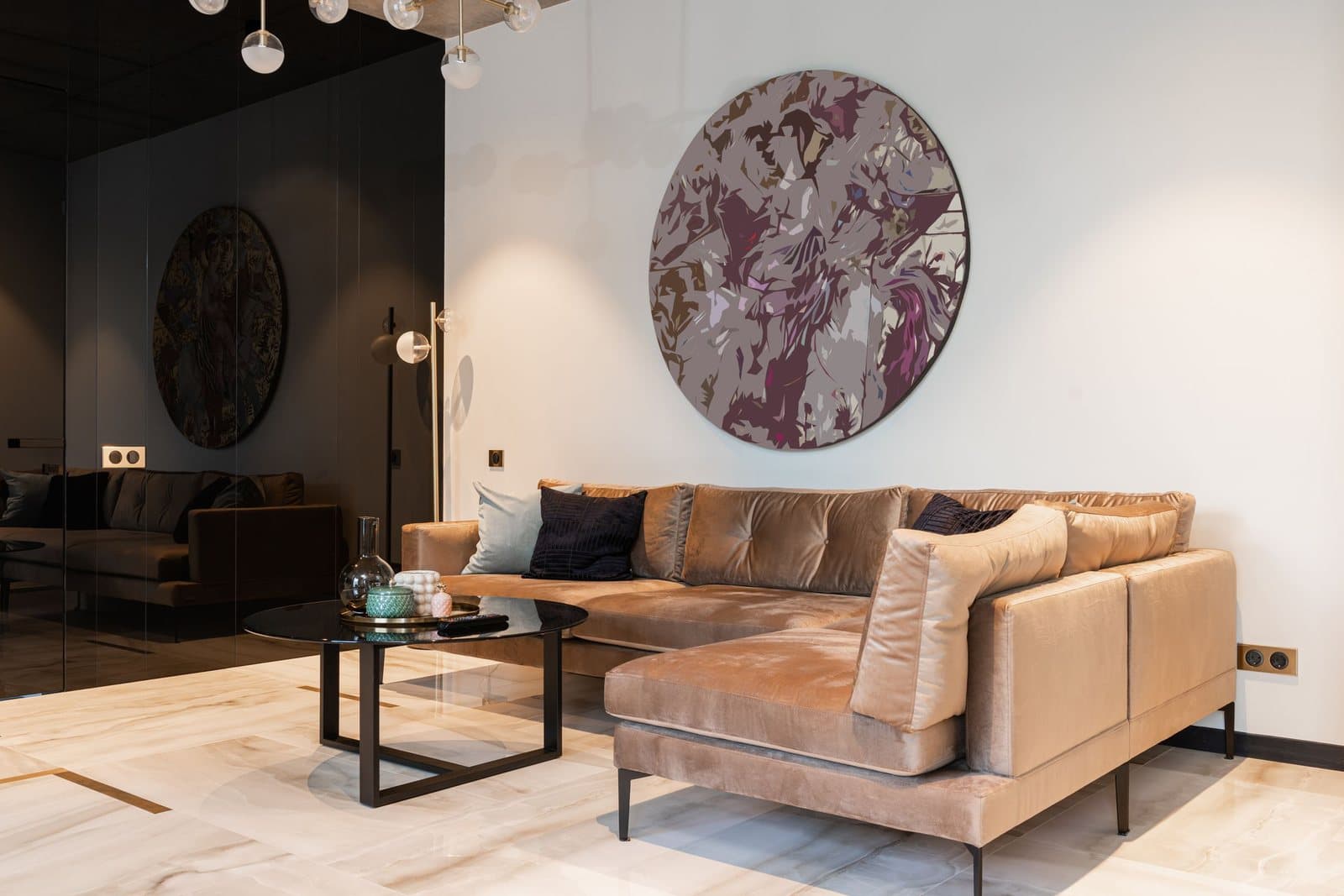
The champion. Art drifts upward for understandable reasons — it feels safer above head height, it gets centered on the wall’s whole expanse rather than in the zone people actually look at, and one person’s “eye level” on a ladder is not eye level from the floor. The result is a picture that addresses the ceiling. The fix is a number: on an open wall, a piece’s center should sit around 57 inches from the floor — gallery height, roughly the eye level of a standing viewer of average height. Above furniture, the relationship that matters is to the furniture: the bottom of the frame should land about 6 to 10 inches above the back of the sofa or the top of the console, close enough that art and furniture read as one arrangement. If your art currently floats nearer the ceiling than the conversation, lowering it is the single highest-value ten minutes in decorating. The full rule and its exceptions are in the guide to how high to hang pictures.
Mistake two: too small for the wall
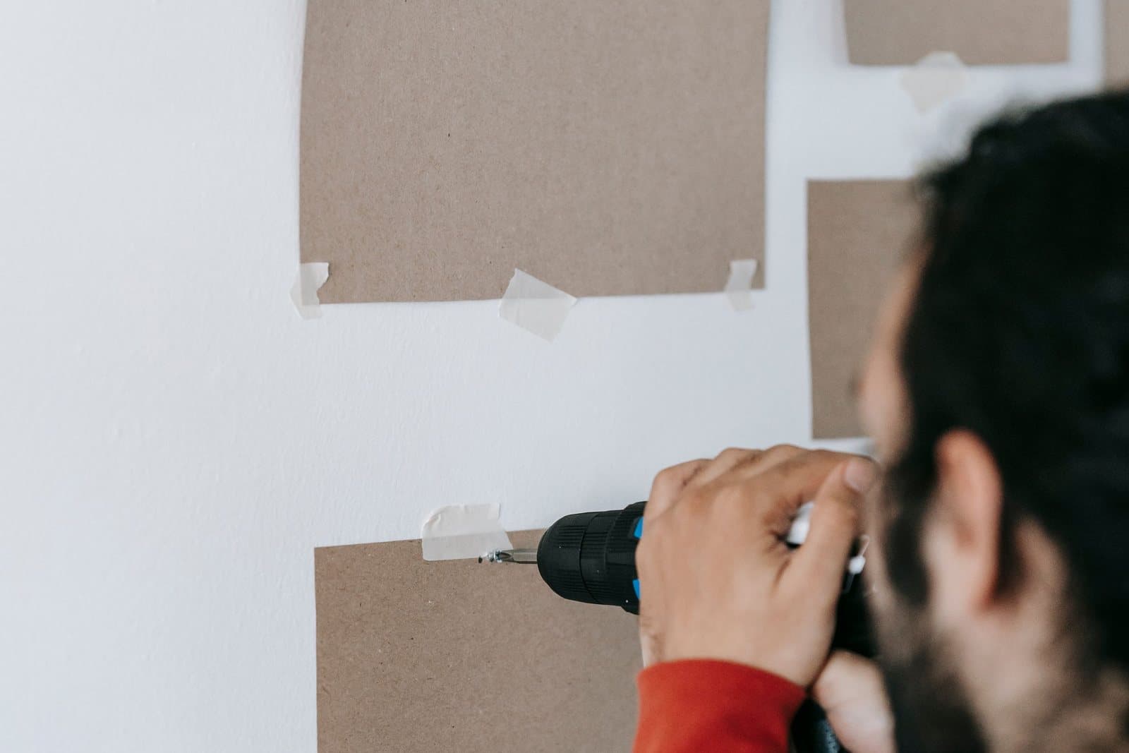
The quiet epidemic of online ordering: the piece looked generous on a screen and arrives to find a wall three times its ambition. The rule that prevents it is proportional — above a sofa, aim for art (or a group acting as one piece) about two-thirds the sofa’s width. Run it on real numbers: an 84-inch sofa wants a footprint near 56 inches wide. A 30-inch piece above it is not wrong because it is ugly; it is wrong because the proportions demote it to decoration-by-apology. Mock the size up in painter’s tape on the wall before ordering, live with the outline for a day, and let the tape deliver the bad news while it is still free. The shop will happily sell you the corrected size once the wall has told you the truth. The ratios for every other spot in the house are collected in the full wall art size guide.
Mistake three: the lonely single
One small piece, centered bravely on a large empty wall, does not look minimal — it looks left behind. Solitude is a scale problem wearing a composition costume, and it has two honest fixes. Scale up: let one genuinely large piece own the wall, with breathing room as its frame. Or keep the piece and give it company: build it into a group with a shared outer boundary and consistent gaps — 2 to 3 inches between frames is the range that reads as intention rather than scatter — so the group, not the individual frame, meets the wall at the right proportion. What does not work is the middle state: adding one more small piece, then another, each as lonely as the first.
Mistake four: clutter with no air
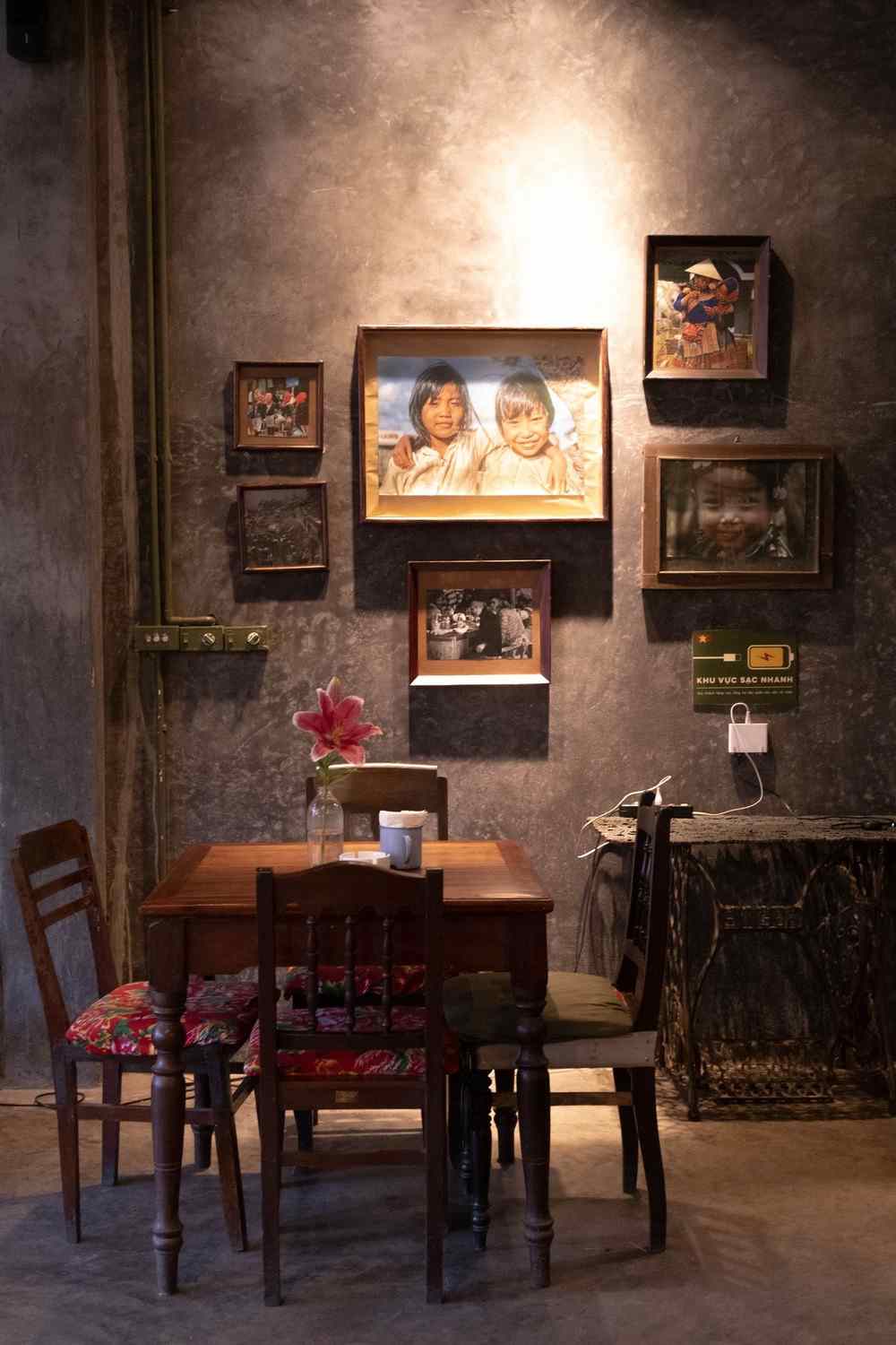
The opposite failure, and common in homes that love art: every piece the household owns, on every wall, all at once, until the room feels like the inside of a frame shop. Walls need editing the way sentences do. Hang the strongest work where the light and the sightlines are, give each piece margin around it, and let some art rest in storage on rotation — a piece that returns after a season away is a small event; a piece that never leaves becomes wallpaper. If a wall holds more than your eye can take in as one or two clear groups, it holds too much. The living room is usually where this discipline pays fastest, because it is where the household’s whole collection tends to migrate.
Mistake five: centered on the wall, not the room
A tape measure will happily center a picture on a wall that the furniture has already claimed off-center — over a sofa pushed into a corner, above a sideboard balanced by a tall plant — and the result looks wrong in a way people feel but cannot name. Art belongs to the arrangement below it: center over the furniture it serves, align a group’s edge with a door frame or a bookcase where that gives a cleaner line, and let the leftover wall be margin. The wall’s geometric center is a fact, not a design principle.
Mistake six: matched to death
The room where the art’s every color reappears, exactly, in the cushions, the rug, and the curtains has coordinated itself into invisibility — the picture looks dyed to order and the eye slides off it. It is an easy mistake to make in good faith, because matching feels like the safe, correct choice, and showrooms encourage it. But a room is not a paint swatch, and art chosen to disappear into a scheme has been wasted money and wall. Art should belong to a room without being its echo: borrow one or two of its colors elsewhere, at different strengths, and let the rest of its palette be its own. Contrast is not a failure of matching; it is how a piece becomes the room’s event rather than its wallpaper.
Mistake seven: ignoring the light
A piece can be the right size, at the right height, in the right company, and still spend its life fighting a reflection. Glossy and glazed art hung opposite a bright window becomes a mirror of the garden for half the day; any art in a room’s dimmest corner fades into the wall it was meant to enliven. The fixes are observation and small moves: look at each piece from where people actually sit, at the hours they sit there, and where glare owns the surface, shift the piece to an adjacent wall, trade places with a matte piece that forgives the angle, or tip the frame a degree forward so the reflection drops to the floor. Where a good piece is simply under-lit, that is a lighting problem with a lighting answer, not a reason to replace the art. How to light wall art — picture lights, angles, and glare — goes deeper on that lighting answer.
The last of the wall art mistakes: hung and forgotten
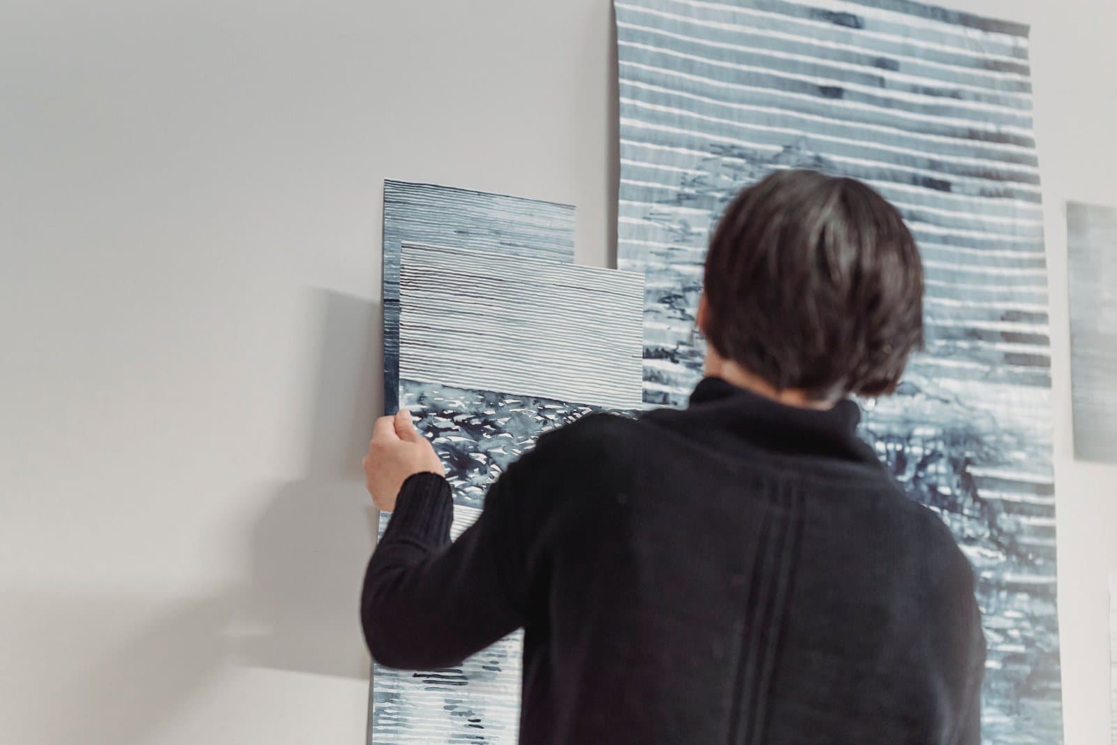
The last mistake is time. Pictures settle a degree off level and stay crooked for years; a piece hung for a former room’s furniture keeps addressing a sofa that left in 2019; sun creeps across a wall over seasons and starts billing a favorite print for the light. Walk your walls once or twice a year with fresh eyes — level in hand, this list in mind — and correct what has drifted. Most of what separates a room that merely has art from a room that is decorated is nothing more than this maintenance of decisions.
If the list feels long, run it as an audit rather than a scolding. Stand in the doorway of one room — the doorway view is the honest one, the first impression every guest gets — and ask the eight questions in order. Is anything addressing the ceiling? Does anything look lost on its wall? Is there a lonely piece, a crowded wall, a group centered on geometry instead of furniture, a palette echoed into invisibility, a reflection where a picture should be? Write down the two worst offenders, fix those this weekend, and stop. Perfection is not the standard; a room whose art has been considered is, and consideration, unlike most decorating, is free. For the deeper dives behind each fix — the height rules, the sizing ratios, the gallery-wall method — the rest of this series lives on the blog, and every one of these wall art mistakes, once seen, stays seen. That is the good news disguised as a list of errors.
More in How-To: Sizing, Hanging & Arranging
Continue exploring: How-To: Sizing, Hanging & Arranging guides · All guides