

Living Room Wall Art Ideas: A Complete Guide
Start with the wall and the sofa measurements, not the shopping — then mood, style and light narrow the choice before size ever becomes a guess.
Key Takeaways
- Choosing living room art well comes down to three decisions made in order: what the art shows, how big it is, and exactly where it hangs.
- Size over a sofa by the two-thirds rule: the piece or arrangement should span roughly two-thirds of the sofa's width — about 48 inches for a 72-inch sofa — with 2- to 3-inch gaps counted in.
- Hang above a sofa relative to the furniture, not the ceiling: the bottom edge belongs 6 to 10 inches above the sofa's back, even though bare walls follow the 57- to 60-inch center rule.
- Borrow two or three colors from the rug, cushions, wood or curtains instead of matching the sofa, and judge the piece in both daylight and warm evening light.
- Give one wall the lead and let the others support it quietly; a gallery needs the same total footprint as a single piece and one consistent thread such as frame color or palette.
The living room is where wall art works the hardest. It is the first room guests read, the wall you face from the sofa all evening, and usually the largest stretch of empty wall in the house. It is also where the most common decorating mistakes happen: a picture that is too small for the sofa under it, hung too high, chosen without reference to the furniture it has to live with.
None of those mistakes are about taste. Good living room wall art ideas come down to three decisions, made in order: what the art shows, how big it is, and exactly where it hangs. Each has simple, learnable rules, and this guide walks through all three with real measurements. For the browse-by-room view of the same ground, see living room wall art; come back here for the reasoning behind the choices.
Start with the wall, not the artwork
Most people shop for art first and figure out the wall later, which is backwards. Begin by deciding which wall leads the room. In most living rooms it is the wall the sofa sits against, or the wall the sofa faces. That wall gets the main piece; every other wall can support it with smaller work, but one wall should clearly be in charge.
Measure that wall, and measure the furniture in front of it: sofa width and back height, console or sideboard dimensions, the distance from the furniture top to the ceiling. Write the numbers down. Almost every wall art sizing rule in this guide runs off those three or four measurements, and guessing at them is how a beautiful piece ends up looking lost — or overwhelming — once it is on the wall.
Living room wall art ideas: choosing a subject first
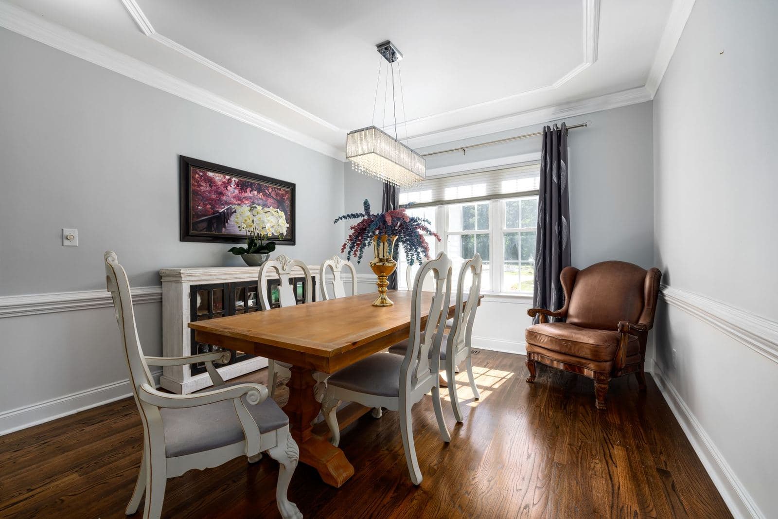
Subject is what the picture is of, and it is the fastest lever you have on how the room feels. Landscapes open a room up: a horizon line and some depth in the image read almost like a window, which is why landscape art is the classic choice over a sofa, especially in rooms that feel boxed in. Abstract art works differently — it brings color, movement, and energy without a literal scene, so it never competes with the television or the conversation for the role of “thing to look at.” It is also the easiest subject to match to a room, because you are matching a palette, not a place.
Photography sits between the two: real places and real moments, with a crispness that suits modern rooms. Botanical studies and still life bring a quieter, more traditional calm. And some subjects earn their wall space by meaning rather than mood — a map of a home town, a skyline from a city you lived in, the coastline you grew up visiting. There is no wrong answer here, but there is a useful order: pick the mood you want the room to hold (calm, energized, gathered, quiet), then pick the subject family that produces it.
Matching style to the room you already have
Style is the visual language of the piece — modern, vintage, minimalist, farmhouse, and so on — and the cheapest way to choose it is to read the room you have already built. Look at your furniture’s lines (clean and straight, or curved and carved), your palette (cool neutrals, warm woods, saturated color), and your materials (glass and metal, or linen and timber). Art in a neighboring style usually works beautifully; art from the opposite end of the map needs a bridge, most often one shared color between the piece and something already in the room.
Keep subject and style as separate decisions. A landscape can be painted in a vintage style or photographed in a starkly modern one, and the two versions do completely different work in the same room. Deciding “landscape, modern” is a far more useful brief than “something nice for the wall.”
Choosing a format for the main wall
Format is the physical form of the piece, and the living room’s main wall is where the differences matter most. Canvas prints are the default for good reason: the image wraps a wooden frame, so the piece has real depth on the wall without glass, glare, or a frame competing with the artwork. Framed canvas and framed paper add a defined edge — a thin float frame or a mat and molding — which suits more traditional rooms and gives smaller pieces extra presence. Acrylic and metal bring a sheen that flatters photography and bold color, but their reflective surfaces argue with windows: on a wall opposite large glass, matte formats almost always read better.
Two practical notes. First, weight: a large canvas is surprisingly light for its size, while the same dimensions in acrylic or metal are substantially heavier, which matters for your hanging hardware. Second, light: if the main wall takes direct sun, favor formats and inks rated for lightfastness, and never hang original works on paper in that spot.
Sizing your living room wall art ideas over the sofa
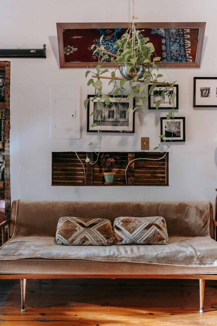
Here is the single most useful number in wall art: above a piece of furniture, the art — or the whole arrangement, if you hang several pieces — should span roughly two-thirds of the furniture’s width. Run the math on standard sofas. A 72-inch sofa wants art about 48 inches wide. An 84-inch sofa wants about 56 inches. A 96-inch sofa wants about 64 inches. Somewhere between half and three-quarters of the sofa’s width reads as intentional; below half, even a lovely piece starts to look like it is floating and apologizing.
For a pair or a gallery grouping, count the total width including the gaps between pieces — keep those gaps consistent at 2 to 3 inches, and treat the whole arrangement as one rectangle that obeys the same rule. Height follows the same logic of proportion: over a standard sofa, a piece in the range of 24 to 36 inches tall fills the space between sofa back and ceiling comfortably in a room with 8- to 9-foot ceilings. In a room with low ceilings, go wider and shorter; a horizontal piece stretches a wall, while a tall piece argues with the ceiling line — the full workings are in our guide to art above the sofa, sized properly.
Hanging height: eye level, with one exception
The gallery standard for a bare wall is to hang art so its center sits 57 to 60 inches from the floor — average eye level. It is a good rule, and it has exactly one big exception, which is furniture. Art above a sofa should be hung relative to the sofa, not the ceiling: the bottom edge of the piece belongs 6 to 10 inches above the sofa’s back. If you apply the eye-level rule over a tall-backed sofa, the art floats up near the ceiling and disconnects from the seating it belongs to. When the two rules disagree, the furniture rule wins.
To hang at a chosen height without guesswork: measure the piece, find its center, and decide where that center falls on the wall. Then measure from the top of the piece down to its hanging point — the wire’s peak or the hanger — and mark the wall at center height plus that offset. Two people, one tape measure, and five unhurried minutes beat any amount of eyeballing and re-drilling.
The television problem, and light
Two features of modern living rooms deserve a plan before you choose anything. The first is the television, which is a large, black, reflective rectangle competing for the same focal wall. The usual resolutions are honest ones: give the art the wall over the sofa and let the TV have the opposite wall with nothing to prove, or, if they must share a wall, treat the TV as one dark panel in a deliberate arrangement and keep the art’s total footprint clearly larger than the screen. What never works is pretending the screen is not there and hanging a small piece beside it to be visually out-shouted.
The second is light, both kinds. Daylight decides glare: matte, unglazed formats — canvas above all — shrug off bright rooms, while glass, acrylic, and gloss metal need walls that light strikes at an angle rather than head-on. Evening light decides warmth: most living rooms are lived in after dark, under lamps, so judge a candidate’s colors under warm light too. A piece that sings at noon and sulks at eight in the evening is the wrong piece for this room, however good it looks in a showroom.
Color: borrow from the room, don’t match it
Beginners try to match the art to the sofa. The better move is to borrow two or three colors from anywhere in the room — the rug, the cushions, the wood tones, the curtains — and let the art gather them into one place. Art that contains the room’s colors without being dominated by the single biggest one (usually the sofa) looks collected rather than coordinated. One deliberate note of contrast is welcome: a mostly neutral room can carry a genuinely bold piece, because the room’s quietness gives the color somewhere to land.
Remember that light will edit your colors. North-facing rooms cool everything down; warm evening lamplight warms it back up. If you can, look at a candidate image in both daylight and the light you actually live in at night before committing to a large piece.
One statement piece, or a gallery?
A single large piece is the calmer choice: one decision, one set of measurements, and a clear focal point. It suits rooms that are already busy with pattern or furniture. A gallery arrangement trades that calm for personality — it is where smaller pieces, photographs, and the odd shaped work get to add up to something. If you go the gallery route, obey the same footprint rule as a single piece, plan the whole layout on the floor or in taped outlines first, and keep one thing consistent across the set: frame color, mat style, palette, or subject. One thread of consistency is what separates a gallery wall from a cluster.
Whichever you choose, give the supporting walls a quieter job. The main wall carries the statement; the others can hold one smaller piece each — a study, a photograph, a plate from the same family — at a scale that clearly defers. Rooms feel designed when the hierarchy is obvious: one wall leads, the rest accompany, and no wall is competing. If every wall is shouting at full volume, the room reads as restless no matter how good each individual piece is. In an open-plan home that same hierarchy also marks where one zone ends and the next begins — see using wall art to zone an open-plan space.
The order of operations
Put it together and living room wall art ideas come down to a short process: measure the wall and the sofa; choose a subject for the mood you want; pick a style that speaks the room’s language; choose a format that suits the light; size the piece by the two-thirds rule; tape the outline on the wall and live with it for a day; then hang it relative to the furniture, not the ceiling. When you are ready to look at art with those decisions made, browse the catalog by room, subject, and format — you will find you can judge pieces in seconds, because you know exactly what job each one has to do. The bedroom asks for the opposite mood, covered in our guide to calm bedroom wall art.
More in Room Guides
Continue exploring: Room Guides guides · All guides