

New York City Wall Art: Skyline and Streets
Name your relationship to the city first — resident, leaver, or dreamer — then choose streets, a quiet icon, or a big view that fits that story.
Key Takeaways
- Name the relationship before choosing: residents suit local street truth, those who left suit the leaving skyline view, and visitors suit vintage material or icons handled quietly
- Handle icons as portraits, not logos: a single tower in fog or the bridge in snow works, while saturated sunsets and postcard crops are what date an icon print
- Commit to scale in one direction: either a consistent grid of street-level studies or one big skyline that spans its furniture — the middle, souvenir size fails
- Dose cab yellow carefully: a single note inside a mostly neutral photograph pleases, while a print led by saturated yellow will fight the room
New York is the most pictured city on earth, which creates a strange problem for its walls: the famous images are so familiar that they can stop registering as pictures and start registering as logos. The taxi-yellow postcard, the skyline at dusk in saturated orange — everyone has seen them, and a room hung with them says less about you than about a gift shop. The way out is not to avoid the city. It is to go one level deeper, because New York City wall art has a second shelf, and it is much better than the first.
New York City wall art icons, handled with care
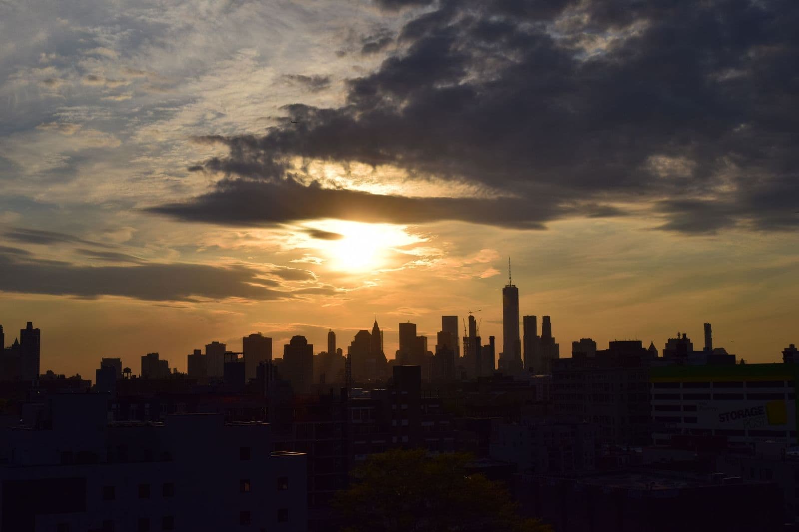
The skyline icons earn their fame honestly. The Empire State and Chrysler buildings are genuinely beautiful objects — the Chrysler’s terraced crown is the finest flourish of American art deco — and the Brooklyn Bridge’s stone towers and cable fans are as much sculpture as infrastructure. Icon images work when they are treated as portraits rather than logos: a single tower in morning fog, the bridge in snow, the skyline from across the water at an hour when the light is doing something. What dates an icon print is not the icon — it is the stock-photo treatment, the saturated sunset and the postcard crop.
Distance is the other lever. A skyline seen whole is a statement about the city; an icon seen close — the crown of one building, one span of cables — is a study of a designed object, and it sits far more comfortably in a considered room. If your instinct says the icons are too much, you probably want them closer and quieter, not gone.
Street level: the city people actually live in
Below the skyline, New York is texture: brownstone facades in rows, cast-iron fire escapes zigzagging down brick, avenues running in long converging lines, steam lifting off the street in winter. Street-level photography trades the emblem for atmosphere, and it is where the city’s character lives — the neighborhoods read differently from one another in a way skylines never do. A row of Brooklyn brownstones, a SoHo cast-iron facade, a Village side street in snow: these are portraits of places at walking pace, and they reward the close looking that a living room gives its art.
Color at street level has one famous accent — cab yellow — and the rule for it is dosage. A single note of it inside a mostly neutral photograph is a pleasure, the way one red coat is in a crowd scene. A print that leads with yellow and backs it with saturated everything will fight the room for the rest of its life.
The park, the bridges, and the seasons
The most underrated New York subject is its great park. Central Park was designed as a landscape argument — that a grid city needs a deliberate countryside inside it — and its images carry that argument onto the wall: lawns and rock outcrops with the skyline standing at the edge of the trees, a reservoir ringed by towers, paths under enormous elms. Park art is the bridge between cityscape and landscape, and for a New Yorker it is often the truest portrait of the city’s daily life. It also brings the seasons into play. This is a city with real winters and theatrical autumns, and its seasonal registers are strong: the park in snow, brownstones under autumn trees, the avenues in summer haze. Choosing a season is choosing a mood, and the same street in January and October is two different pieces of art.
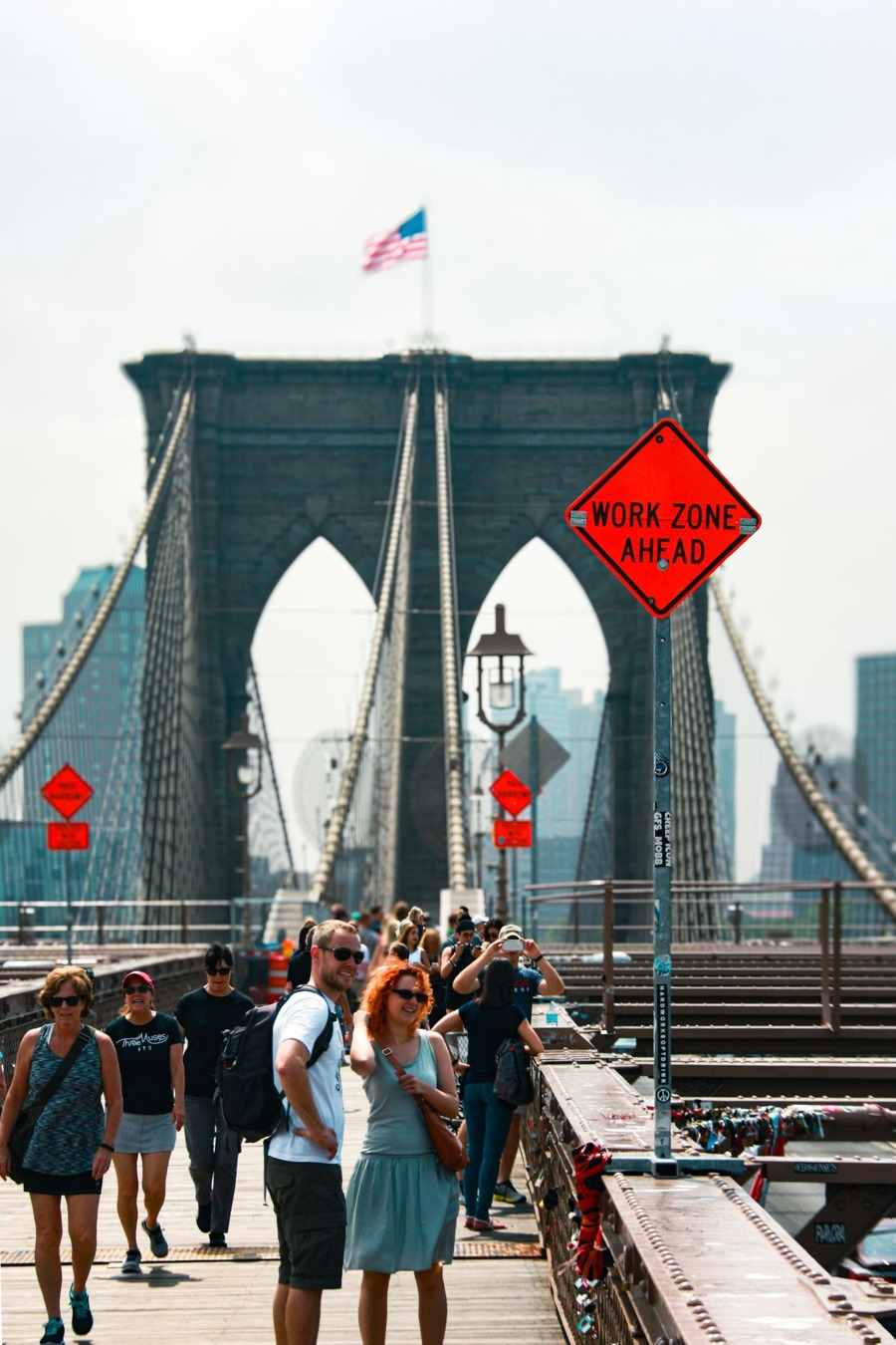
The bridges deserve a second word as subjects in themselves. New York is a city of islands, and its bridges are its connective tissue — stone Gothic towers on the oldest, great steel spans on the newer. A bridge image gives a room both engineering and water, structure and reflection, and it is the New York picture most likely to be mistaken, happily, for a work about form rather than a souvenir of a place.
The vintage layer
New York also offers a deep historical shelf that few cities match. The city was photographed early and obsessively, and its early-twentieth-century material — construction-era skyline photography, the great bridges rising, streets in the age of the elevated trains — has a gravity that modern shots rarely reach. The poster tradition runs alongside it: subway-era and travel posters with bold flat color and deco lettering, which suit modern rooms surprisingly well because their design language is the ancestor of half the graphics around us now. Vintage New York is the connoisseur’s shortcut: unmistakably the city, immune to postcard fatigue.
Which New York City wall art is yours
A practical way to choose is to name the relationship. If you live there, hang the local truth: your borough’s streets, the view from your side of the river, the park entrance you actually use — art as a portrait of your own geography, which never feels like a postcard because it is not one. If you left, hang the skyline you used to check from the train: the leaving view, the one with the ache in it. If you visit and dream, hang the vintage layer or the great icons handled quietly, the city as idea. And if the city is simply the strongest image on your shortlist, hang the architecture — a facade, a span, a crown — and let the place be incidental. The only wrong answer is the generic one, chosen because it was expected. Naming the relationship is, in miniature, the whole art of how to choose a wall art subject.
Grids, pairs, and the one big view
New York is one of the few subjects that supports a grid. Because the city is itself a grid, a set of four or six street-level studies — a facade, a bridge detail, a park path, an avenue — in matching frames composes the way the boroughs do: distinct pieces, one unmistakable whole. A grid suits hallways, stairwells, and the wall behind a desk, anywhere seen in sequence and up close. Keep the register consistent inside the grid — all monochrome, or all of one season — so the set reads as a survey rather than a scrapbook.
The alternative is the single big view, and it should be big: a skyline treated as a window wants to span the furniture it hangs over, and the city’s scale is the rare subject that does not overwhelm at size, because the viewer reads it as environment rather than object. What fails is the middle scale — the famous view at souvenir size, too small to be a window and too familiar to be a study. With this subject, commit in one direction or the other: the survey, or the panorama.
Styling it at home
Black-and-white is the city’s natural register for interiors — the architecture is strong enough to carry a room without color, and monochrome prints layer calmly over both modern and traditional furniture. Color earns its place in the blue-hour skyline and the autumn street scene. In a living room, one large skyline or one architectural study above the sofa is the complete statement; a pair of street scenes at matching sizes can carry a smaller wall with more narrative. Resist the triptych of three famous landmarks — that way lies the gift shop again.
New York City wall art is one portrait inside the wider family of cityscapes, and the choice within it is finally personal: the skyline is the city as ambition, the street is the city as home. New Yorkers tend to hang the streets they know; everyone else hangs the skyline they dream about. Both are true portraits. Pick the one that is true for you, print it at a size with presence, and the most pictured city on earth becomes, on your wall, unmistakably yours. Its sister portrait, London wall art, finds the same depth in grey skies and a single red accent.
More in Subject Guides



Continue exploring: Subject Guides guides · All guides