

Typography Wall Art: Words That Earn Space
Read it aloud in the room before you hang it: a line on a wall gets read every day, so it has to survive the hundredth reading, not just the first.
Key Takeaways
- Apply the hundredth-reading test: plain truths like names, places, and dates, or open lines of poetry and lyric, last longest, while instructions to be happy or grateful sour fastest
- Live with shape first, sentence second: you see the letterforms daily at reading distance, so weight, spacing, alignment, and restrained colour matter as much as the words
- Size for legibility from the real reading distance: statement phrases should read across the room, while dense specimen or page pieces belong where people naturally stand close
- Choose shared-room text together: typography in shared spaces is public speech in the home, so save pointed, personal lines for rooms that are yours alone
Every other kind of wall art shows you something. Typography wall art says something — and that difference is why it is the easiest subject to get wrong and the most personal to get right. A word on a wall is read every single time it is seen; it cannot fade into the background the way a landscape can. Choose well, and the print becomes the room’s voice. Choose carelessly, and you have hung a sentence you will be tired of by spring. This guide is about the typography subject alone: the forms lettering-as-art takes, how to choose words that can bear repetition, and the rooms where text works hardest. It is one subject among many, and choosing among wall art subjects is a decision this series takes up on its own.
The forms typography wall art takes
Typography art spans a spectrum from a single letter to a full page of text. At one end sits the single word or short phrase — a command, a blessing, a joke between the household and itself. These pieces work graphically first: the word’s shape, its letterforms chunky or elegant, matters as much as its meaning, because at reading distance the piece is a picture and only at speaking distance is it a sentence. In the middle sits the quotation print, a line or two from a writer, song, or family saying, where meaning leads and design serves. The song lines are borrowed from another subject’s shelf — music wall art claims the posters and instruments, but the lyric print is where the two subjects meet. At the far end sits lettering as pure pattern: alphabet charts, vintage signage, sheet text, and specimen posters where the words may not even be meant to be read — the texture of type itself is the art. The alphabet chart in that family is usually a child’s first piece of wall art, and the room it belongs to has a guide of its own: kids’ room wall art that grows up with its owner.
Knowing which form you are choosing prevents the commonest disappointment: buying a piece for its words and discovering you live with its letterforms. Live with both, in that order of daily exposure — shape first, sentence second, every day.
Choosing words that survive repetition
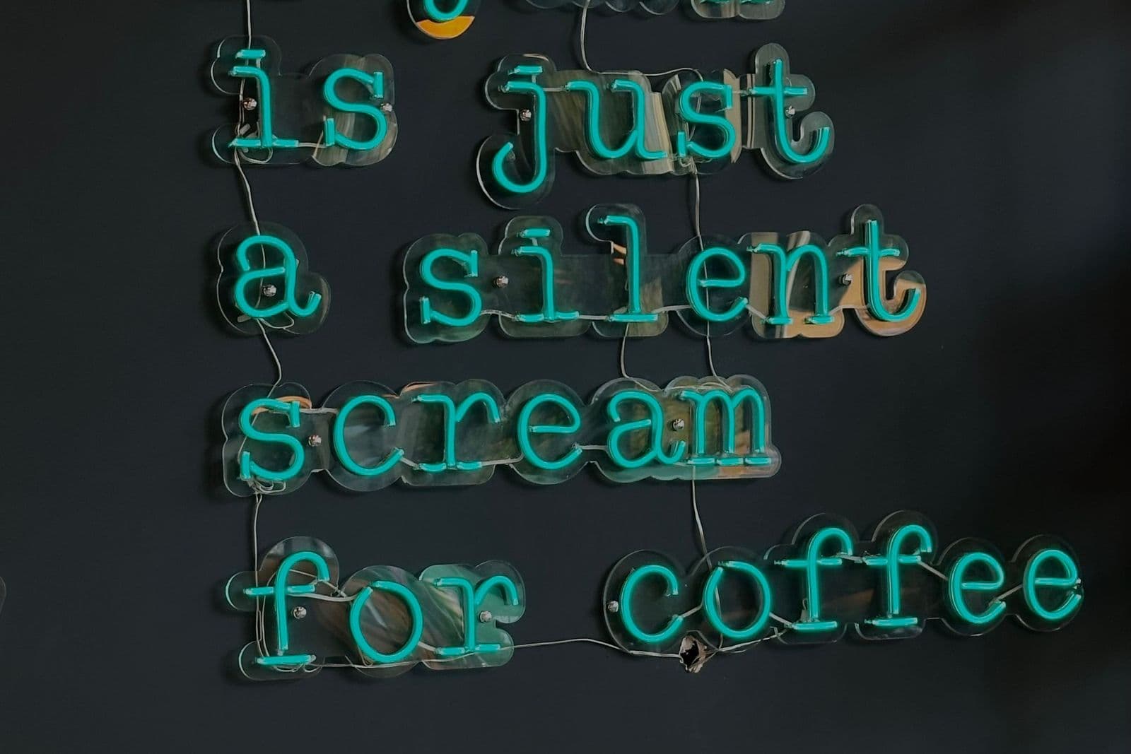
The test for any text print is the hundredth reading. A line that delights on the first morning and grates by the fiftieth should not be hung at eye level in a room you use daily. Words that survive repetition tend to share a quality: they are either true in a plain way — names, places, dates, honest instructions — or open enough to re-read, lines of poetry and lyric that give back a little more each time. Words that expire fastest are the ones performing an emotion on the viewer’s behalf: instructions to be happy, relaxed, or grateful sour into irony the first bad week they witness.
Consider, too, who else must live with the sentence. Typography in shared rooms is public speech inside the home; a phrase that is witty to one household member and grating to another will be read by both, daily. The pieces that last longest in shared spaces are the ones chosen together — a shared joke, a family word, the name of the place you all came from. Save the pointed, personal lines for the rooms that are yours alone, where their audience is guaranteed.
In typography wall art, letterforms are the picture
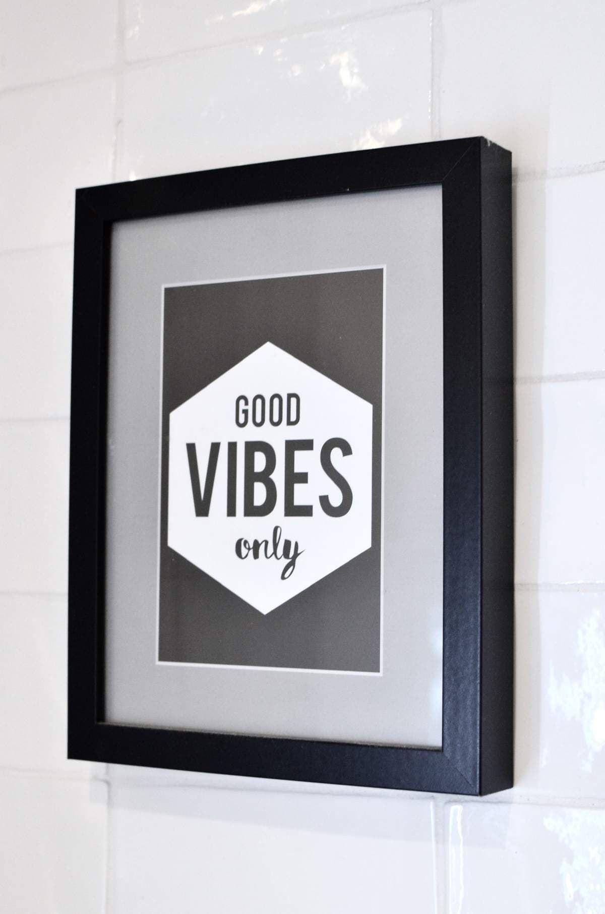
Since the design is the content’s body, judge typography art as design. Weight matters: bold, heavy letterforms shout at a distance and suit large rooms and short words; light, refined type whispers and rewards approach. Spacing matters: lettering crowded edge to edge feels urgent, while a small word given a whole page of white feels calm and certain. Alignment is mood — centered text reads ceremonial, left-aligned text reads literary, and scattered or overlapping lettering reads playful or chaotic depending on its control.
Color discipline separates the strong pieces from the novelty ones. The most durable typography art uses black on white, white on black, or one ink color on a quiet ground — the restraint of a book page. Rainbow lettering and novelty fonts date quickly because they are tied to a moment’s graphic fashion. If the words are worth hanging, they are worth hanging in letterforms that will still look considered in a decade.
Where words work hardest
The laundry room is typography’s friendliest territory: a small, functional room where a dry instructional joke or a single honest word lightens a chore, and where text’s directness matches the room’s purpose. Kitchens follow — market lists, menus, and pantry labels blown up to art scale have a long poster tradition behind them. Entryways suit a house’s chosen word the way a sign suits a door.
The home office is the subject’s most serious room. A line you actually work by — a standard, a reminder, a motto earned rather than borrowed — can hold a desk wall with real authority. This is also the room where borrowed inspiration wears thinnest, precisely because you will read it while working, when your standards for sincerity are highest. Choose the office’s words as carefully as you would choose advice.
Bedrooms ask the most restraint: whatever you hang there is among the first things read each morning. Many people find a single word, a name, or a date — text with the least to prove — sleeps best. Let the living rooms carry the conversation pieces; let the typography near your bed be the kind that can be read half-asleep and still be welcome.
Found words: signage, labels, and ephemera
A whole wing of the subject is not designed as art at all: the printed matter of everyday life, enlarged and framed. Old shop signs, enamel advertisements, transit notices, seed packets, sheet-music covers, and market labels were lettered by commercial artists who knew their words would be read at a glance across a street — and that functional discipline makes them superb wall pieces, bold and clear with a period flavor no modern designer quite reproduces. Vintage-style pieces in the same spirit carry the look without the auction hunt. Either way, the rule of the genuine articles applies: the fewer words, the stronger the piece, because the originals were made to be read in one breath.
Readability sets the sizing rule for the whole subject. A text print should be legible from the distance it will actually be read — across the room for a statement phrase, at arm’s length only for dense specimen or page pieces meant to be approached. If you must squint from the sofa, the piece is hung in the wrong room or printed at the wrong size; move it to a hallway or desk wall where readers naturally stand close, and it becomes a discovery instead of a frustration. Pairing text with imagery asks for the same discipline: one piece speaks, the other illustrates, and a wall where every piece is talking at once tires exactly like a room where everyone is.
A last check before you hang a sentence
Read it aloud, once, in the room. Typography wall art is speech made permanent, and speech reveals itself out loud: the line that sounds smug, stale, or shrill when spoken will look that way on the wall within the month. If it survives being said in your own voice, in your own room, it has earned its wall space — and it will go on earning it, quietly, at every reading. Words are the one subject you cannot stop reading; the whole art lies in choosing ones you will never want to stop.
More in Subject Guides
Continue exploring: Subject Guides guides · All guides