

Cityscape Wall Art: Skylines and Streets
Decide the distance first — a distant skyline reads as calm pattern, while a street-level view rewards close looking — and the rest of the choice gets easier.
Key Takeaways
- Decide distance first: skylines read as the idea of a city and scale up calmly, while street-level scenes carry narrative and suit smaller walls seen up close
- Match the surface to sharpness: metal or acrylic keeps window grids, cables, and brickwork crisp, while canvas suits painterly, rain-softened or atmospheric images
- Use night skylines for quieter rooms: mostly dark field with lit windows, they read as restful in bedrooms and media rooms despite the urban subject
- Give skylines width: a panoramic piece spanning most of the sofa or desk below it creates the wall-as-window effect, while street scenes need to be large enough for their details to read
Every other landscape subject offers a room an escape from the built world. The cityscape offers the opposite: energy, geometry, and the particular beauty of places people made. Cityscape wall art suits people who feel restored by a skyline rather than a shoreline — and rooms that run a little cool and quiet and could use a current running through them. It is also a bigger and more varied subject than it first appears, and choosing well starts with knowing which of its two families you actually want. It is one stop on the wider tour of wall art by subject, where the choosing itself is the subject.
Cityscape wall art: skyline versus street level
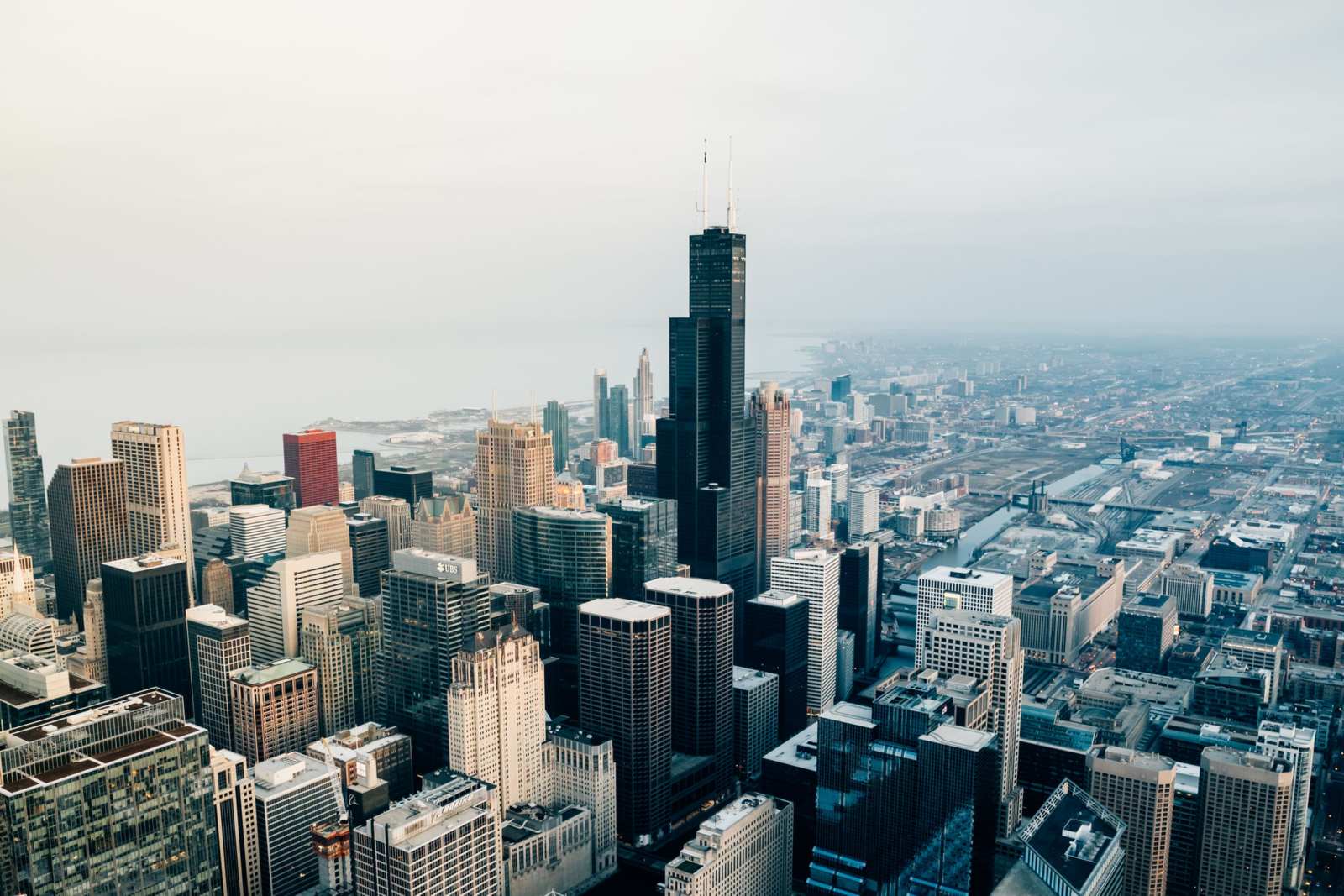
The skyline is the city as silhouette and symbol: towers massed against sky, usually seen from across water or from a distance that turns buildings into a single rhythmic shape. Skylines are graphic, calm at a distance, and generous to large walls — the image is mostly pattern and light, so it scales up without getting busy. They read as the idea of a city, which is why a skyline of somewhere you have never lived can still work: you are hanging urban energy, not biography.
Street level is the city as texture: avenues converging, bridges from below, fire escapes, market streets, the geometry of rooftops and water towers. Street-level images reward close looking and carry more narrative — someone is always implied just outside the frame. They suit smaller walls and rooms where art is seen up close, and they ask more of the viewer, which in a quiet room is a virtue and in a busy one can be noise. Decide the distance first; everything else follows.
More views than the postcard admits
Between the skyline and the sidewalk, cityscape art has several further registers worth knowing. Aerial and rooftop views look across or down — roof landscapes of water towers and vents, the grid of streets from a height — and turn the city into pattern; they are the most abstract cityscapes and the easiest to live with at large sizes. Bridges deserve their own line: a bridge is engineering you can read at a glance, stone or steel drawn against sky and water, and bridge images combine the skyline’s grandeur with the street’s structure. Architectural details — one facade, a fire escape, a staircase, a dome against weather — are the close-up register, portraits of buildings, and they suit the small wall and the study. And transit — elevated lines, stations, platforms in raking light — brings the city’s motion into frame, the register with the most narrative per square foot.
The point of the catalogue is freedom. A room that would be overwhelmed by a full skyline may be perfect for a bridge study; a collector who finds street scenes busy may love the rooftop pattern. Cityscape is not one look but a shelf of them, all sharing one subject: the beauty of the made environment.
Black-and-white versus color
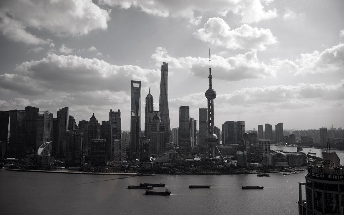
Cityscapes divide cleanly by palette because architecture is form before it is color. Black-and-white strips a city to structure: light raking across facades, the pattern of windows, bridges as pure engineering drawing. It is the timeless register — a monochrome skyline cannot date by its color grading — and it integrates with almost any decor, which is why it dominates offices and modern living rooms. Color cityscapes are about a moment: the blue hour after sunset when windows light up, wet streets doubling the neon, autumn light on brick. They are warmer, more emotional, and more specific — and they need the room’s palette to leave them room.
Night scenes deserve their own mention. A city at night is largely darkness organized by points of light, which makes night cityscapes surprisingly restful in bedrooms and media rooms despite their urban subject — the image is mostly dark field, and the lit windows read the way stars do. If you love the city but not visual noise, the night skyline is your compromise. Most of these cityscapes are photographs, and the photography as wall art guide covers what makes a photographic print hold a wall in the first place.
Formats that serve architectural lines
Hard edges and fine repetitive detail — window grids, cables, brickwork — are what soft surfaces forgive least. This is the one subject family where a metal print’s crisp, smooth surface genuinely earns its place: lines stay lines, and the slight sheen suits glass-and-steel subjects. Acrylic does similar work with more depth. Canvas remains right for the painterly end of the subject — atmospheric skies, rain-softened streets — where a little texture blur is atmosphere rather than loss. Match the surface to the image’s sharpness, not to habit.
Shape follows the subject just as directly. Skylines are born wide: a panoramic format lets a skyline run the way it does in life, and a standard rectangle cropped tight on towers can feel like a specimen. Street scenes and architectural studies, being excerpts anyway, take standard and vertical formats happily — a vertical frame suits towers and avenues the way it suits trees.
Where the city hangs best
The home office is the cityscape’s home room: urban imagery keeps company with work, ambition, and the view from a desk, and a skyline behind a workspace reads as a window onto the professional world. Living rooms take the large skyline or the moody street scene as their main piece, especially in homes whose own architecture is modern. Entryways — transitional spaces, seen briefly — suit the graphic end: a bold monochrome excerpt that sets an urban register for the home in one glance.
Choosing an era in cityscape wall art: old stone or new glass
Cities are layered in time, and cityscape art lets you pick your century. Historic registers — stone skylines, old bridges, the city before glass — read warm and settled and sit well in traditional rooms; vintage photographs and posters of a city’s past are the deepest shelf here. Contemporary registers — glass towers, new landmarks, the skyline as it stands this decade — read sharp and ambitious. Layered images, where a church spire shares the frame with a tower crane or a glass slab, are the connoisseur’s choice: they show the city as it actually is, a work permanently in progress. Match the era to the room’s own story — a renovated old house and a layered skyline understand each other.
Sizing the city
Two sizing instincts serve this subject. Skylines want to be wide more than tall: the panorama is their native shape, and crowding a skyline into a square costs it the rhythm of tower after tower. Above a sofa or a desk, a wide skyline spanning most of the furniture below it reads as a view — the wall-as-window effect — and that is the placement where the subject earns its keep. Street-level and detail images obey the ordinary rules of any close-looked art: big enough to read from where the room actually views them, which for a narrative street scene means larger than instinct suggests, since the story lives in the details.
Which city, whose city
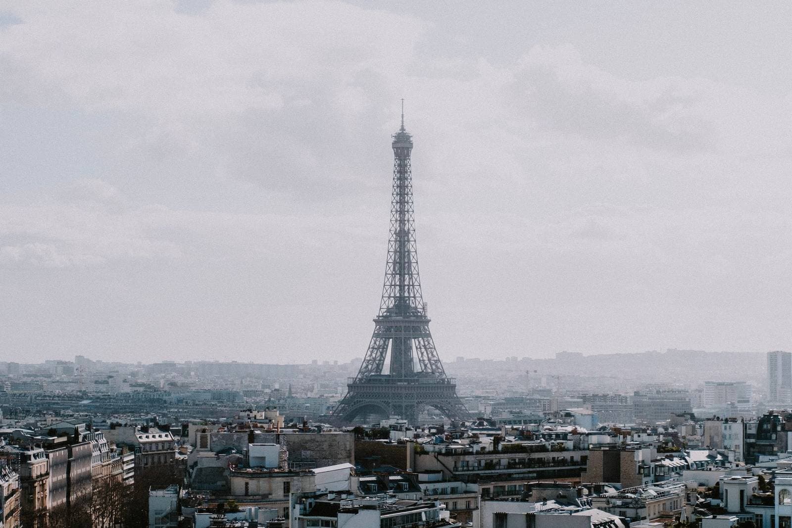
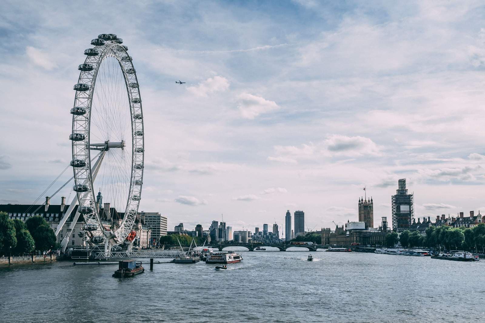
One more pairing deserves a mention: the city beside itself. A skyline on one wall and a street-level study on the adjacent wall — distance answered by detail — is the most sophisticated arrangement this subject offers, and it works wherever two walls meet at a corner the room actually uses. The two images should share a register, both monochrome or both of an hour, so the corner reads as one thought rather than two purchases. Three honest reasons to hang a city: it is yours — the place you live or come from, and the image is a portrait of home; it is loved — a place that changed a trip or a year of your life, and the image is a kept memory; or it is anonymous — no city in particular, chosen purely for its light and lines. All three are legitimate, and knowing which one you are buying prevents the only real mistake in cityscape wall art: a postcard icon hung out of obligation, famous and unloved. The city posts in this series take up New York, Paris, and London one at a time — but the principle travels to any skyline: choose the view you would stop for, and the wall will hold it.
More in Subject Guides


Continue exploring: Subject Guides guides · All guides