

Paris Wall Art: Rooftops, Cafes, Soft Light
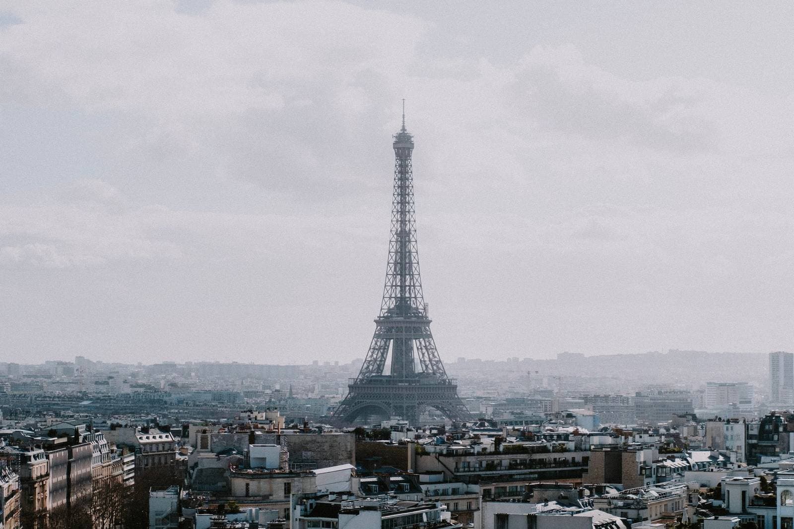
The most Parisian view may be its rooftops — zinc, chimneys, and soft grey-gold light — rather than a tower centered on a pink sky.
Key Takeaways
- Start with rooftops and light: waves of blue-grey zinc, chimney pots, and the city's soft grey-gold diffusion are more recognisably Parisian than an isolated monument
- Handle the Eiffel Tower by distance, detail, or vintage treatment: as one element in a roofscape, as close-up ironwork, or in period imagery — not centered alone at postcard scale
- Choose one register per room: soft photography for mood or vintage posters for graphic statement, and keep a set consistent in register, frame, and hour
- Let the piece be the room's only French reference, and favour middle sizes for studies — the wide roofscape above a bed or sofa is the main exception that can go large
Paris carries the opposite risk to New York. Where New York art can turn into a logo, Paris art can turn into a greeting card — all romance, no substance, the tower pasted onto pink sky. The real city is better than its souvenir version in a specific way: Paris is a city of surfaces and light, of zinc roofs and limestone facades and long grey-gold afternoons, and Paris wall art that works from those materials earns every bit of its romance. The romance should be a conclusion the picture reaches, not a caption it carries.
Paris wall art from above: the rooftops
The most Parisian view is not a monument at all. It is the roofscape: waves of blue-grey zinc, steep mansard slopes, ranks of chimney pots, a dome or tower rising in the distance to tell you where you are. Rooftop images have a palette no other city produces — slate, pearl, chimney red muted to rust — and a texture like a sea seen from a hill. They are romantic in the way the city itself is: incidentally, as a byproduct of how it is built. A large rooftop photograph is the connoisseur’s Paris piece, recognizable to anyone who has stood at a high window there and quietly decorative to everyone else.
The Seine and the gardens
Paris is organized by its river, and river views are the city’s most balanced compositions: water in the foreground, a bridge crossing the middle distance, and a roofline or dome closing the top. They hold everything that makes the city itself — stone, water, weather, and great buildings kept at a courteous distance — and they are consequently the easiest Paris images to live with at large sizes. The bridges reward attention as subjects in their own right: gilded and sculptural on the grandest, plain iron on the working ones, each giving the river scene a different century.
The gardens are the other Paris — the formal green rooms the city built inside itself. Luxembourg and Tuileries imagery, all gravel paths, clipped trees, chairs angled toward a fountain, gives a room the city’s calm rather than its monuments, and it is the Paris that suits readers and slow mornings. Garden pictures also solve the green problem: a Paris image can carry a garden’s foliage into a room that wants plants it cannot keep alive.
Cafes, boulevards, and the street
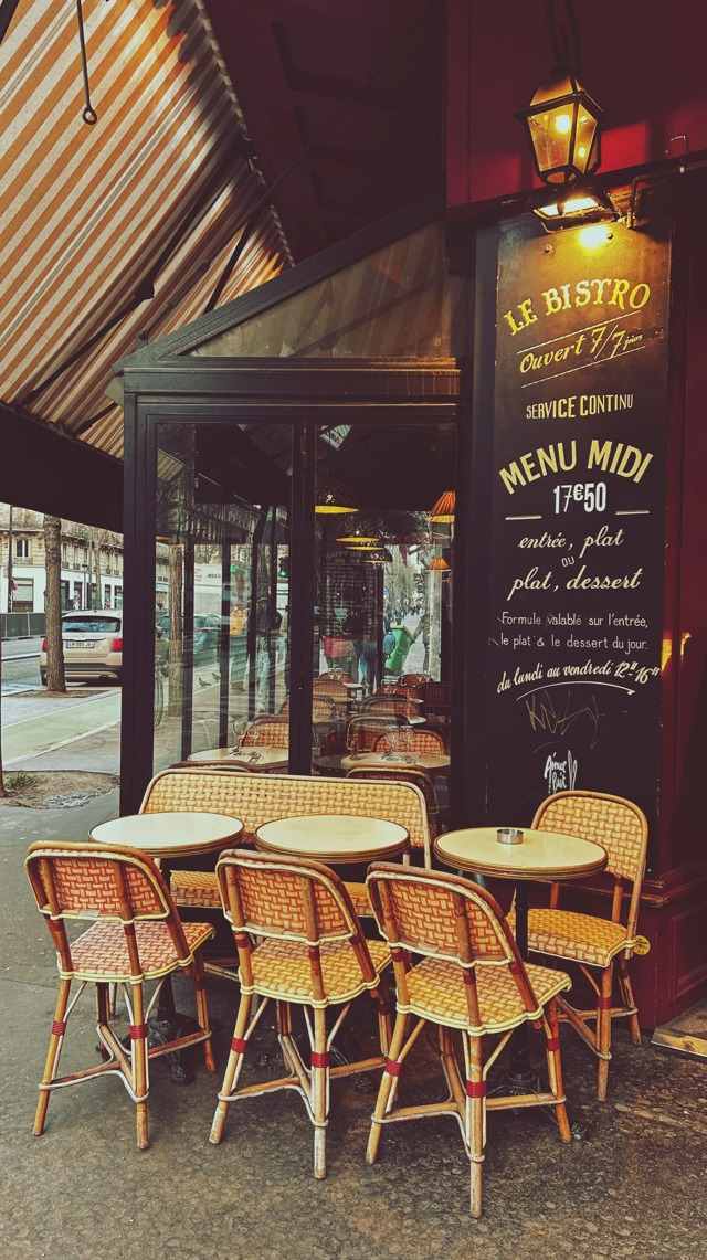
At street level the classic subjects are the cafe terrace, the broad boulevard with its rows of trees, the bookstalls along the river, the market street in morning delivery-hour bustle. These scenes work as art when the photograph treats them as light studies rather than checklists — a terrace in raking afternoon sun, wet cobblestones doubling the lamps after rain. Beware the composition that assembles every emblem at once, tower plus cafe plus bicycle with baguettes; Paris reduced to a prop list is Paris lost. One emblem, or none, and let the light do the talking.
The tower problem
The Eiffel Tower is among the most reproduced structures in wall art, and the question is not whether but how. Three approaches survive scrutiny. Distance: the tower as one element in a roofscape or skyline, at the scale the city itself gives it. Detail: the ironwork close up — lattice, rivets, the geometry of the arches — where the monument becomes an abstract structure and the cliché falls away. The vintage treatment: construction-era photography and old poster renderings, where the tower arrives with history attached. What fails is the isolated tower, centered, pink-skyed, at postcard scale: the single most fatigued image in home decor.
Soft photography versus the poster tradition
Paris invented the artistic poster — the great lithographs of the 1890s turned advertising into gallery art — and vintage Paris posters remain a live decorating tradition: flat color, elegant lettering, subjects from cabarets to railway excursions. They bring graphic confidence and a period warmth, and they pair well with modern furniture precisely because their design is so assured. Against them, the soft photographic palette — mist, dawn, the grey-gold light the city is famous for — offers the quieter Paris: atmosphere over emblem. The two registers rarely belong in the same room; choose whether your Paris is a mood or a statement and commit.
The facade register: architecture up close
Paris also rewards the close view. The nineteenth-century rebuilding of the city left it street after street of disciplined limestone facades — tall windows, continuous balconies, carved stone running in unbroken rhythm — and photographs of that fabric make superb architectural art: more pattern than picture, calm in the way a colonnade is calm. A single window with its shutters and geraniums, a doorway with its lantern, a staircase glimpsed through an arch: these details are the Paris of residents rather than visitors, and at home they read as sophistication rather than tourism. Hung in a pair or a grid, facade studies behave like the vintage plates of an architectural survey — the city documented one beautiful surface at a time.
Light ties the whole Paris shelf together, and it is worth naming as a choosing tool: the city’s famous softness comes from latitude and river air, a diffusion that flattens harsh shadows and wraps buildings in tone. When you compare Paris images, the ones that feel right almost always share that envelope of gentle light, whether their subject is a roof, a cafe, or a facade. Trust the light and the subjects will follow.
Pairs, series, and the Paris set
Paris rewards the set. A pair — two rooftop views at different hours, a facade study beside a river scene — hung with identical frames and a hand’s breadth between them lets the city be a place rather than a postcard: more than one thing true at once. Series work the same way down a hallway, the river bridges in sequence or the seasons over one square. The discipline that makes a set feel curated is register: all photography or all poster, all dawn-soft or all graphic. Paris supplies enough variety inside any one register to fill a home; it does not need two registers arguing on the same wall.
Night deserves its own note. Paris after dark — lamps along the river, lit windows in the facades, cafe glow on wet stone — is the city’s most forgiving register for a dramatic room: mostly warm dark, organized by points of gold. A night Paris in a dining room, where the real light is lamplight too, makes the picture and the room rhyme.
Where Paris wall art hangs
Scale in Paris wall art is a matter of intimacy. The city’s images are studies more often than panoramas, and they generally reward the middle sizes — large enough for the light and detail to register across a room, never so large that a quiet facade becomes a billboard. The great exception is the roofscape, which behaves like a landscape and takes the wide wall above a bed or a sofa the way a horizon does. It is the one Paris view that plays by cityscape wall art’s rules: wide, calm, and mostly pattern and light. The bedroom is the soft-photography Paris’s home — rooftops and river mist in pearl tones above a bed is a combination that has never once felt wrong. Dining rooms take the poster tradition and the cafe scenes, appetite being a Parisian subject in itself. A dressing area or a quiet hallway suits the small vintage print, seen close and often. In each case the discipline is the same: let the piece be the room’s only French reference. The accent wall does not need a matching accent cushion in a script font.
Paris is one of the three city portraits in this series — London wall art is the grey-and-red one — a child of the wider cityscape family, and its lesson generalizes: a famous city earns its wall by being seen, not summarized. Choose the roofscape over the souvenir, the light over the logo, and Paris will do for a room what it has done for painters for two centuries — make ordinary hours look golden.
More in Subject Guides

Continue exploring: Subject Guides guides · All guides