

London Wall Art: Grey Skies, Red Accents
Grey does the work here: pearl, slate, and fog, with a single red accent counted carefully — one bus or box, placed off-center, is enough.
Key Takeaways
- Count the red: one off-center bus, telephone box, or post box inside an honest grey photograph lasts, while several red elements in one frame tips into theme park
- Match the register to the room's temperature: posters and maps for formal, bookish rooms, grey-and-red or river skylines for modern pale rooms, and full-color streets for warm domestic rooms
- Do not shrink documentary pieces: posters and historic maps need middle sizes and up so their lettering and street names can actually be read
- Favour weather in street images: soft grey light and wet pavement doubling the light are London's signature, and night and fog images suit dining rooms, dens, and bedrooms
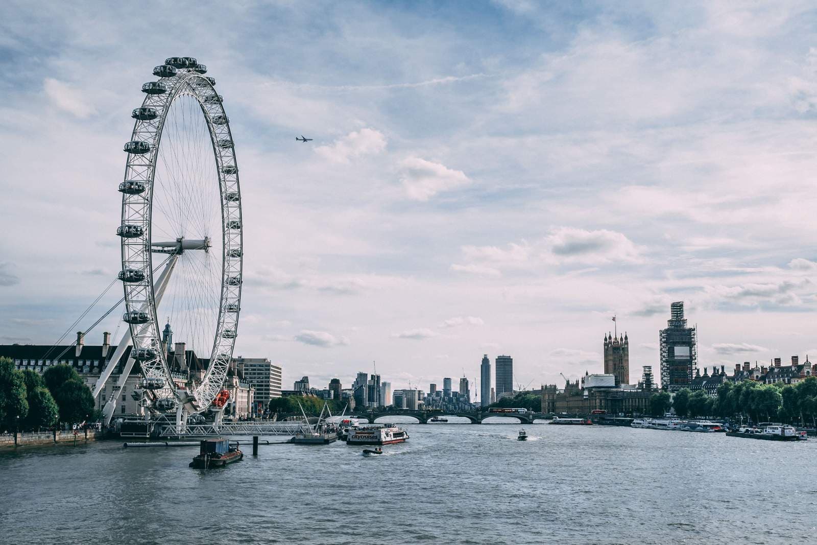
London’s palette sounds like a disadvantage until you hang it: grey skies, grey river, grey stone. In practice it is the most interior-friendly of the great city palettes, because grey is a family of tones rather than a single flat color — pearl, slate, fog, soot — and because London threads one famous accent through all of it. London wall art is an exercise in that balance: a long, layered city rendered in soft tones, with red used the way a tailor uses a pocket square. Small, exact, and unmistakable.
London wall art skylines: old city, new towers
London’s skyline is a conversation across centuries that few cityscapes can match: a great dome and a clock tower at one end of the story, glass towers of deliberately odd shapes at the other, and the river bending through all of it deciding every view. Skyline images work best when they honor that layering — old and new in the same frame, seen across the water in the city’s habitual soft light. The Thames is the composition’s best friend: it gives the eye a leading line, doubles the lights at dusk, and explains why so many of the classic viewpoints stand on bridges. A wide river view is the London skyline at its most itself. New York City wall art tells the opposite skyline story — the skyline as ambition, in a single register — which is why the two cities reward such different walls.
Grey and red: the photographic palette
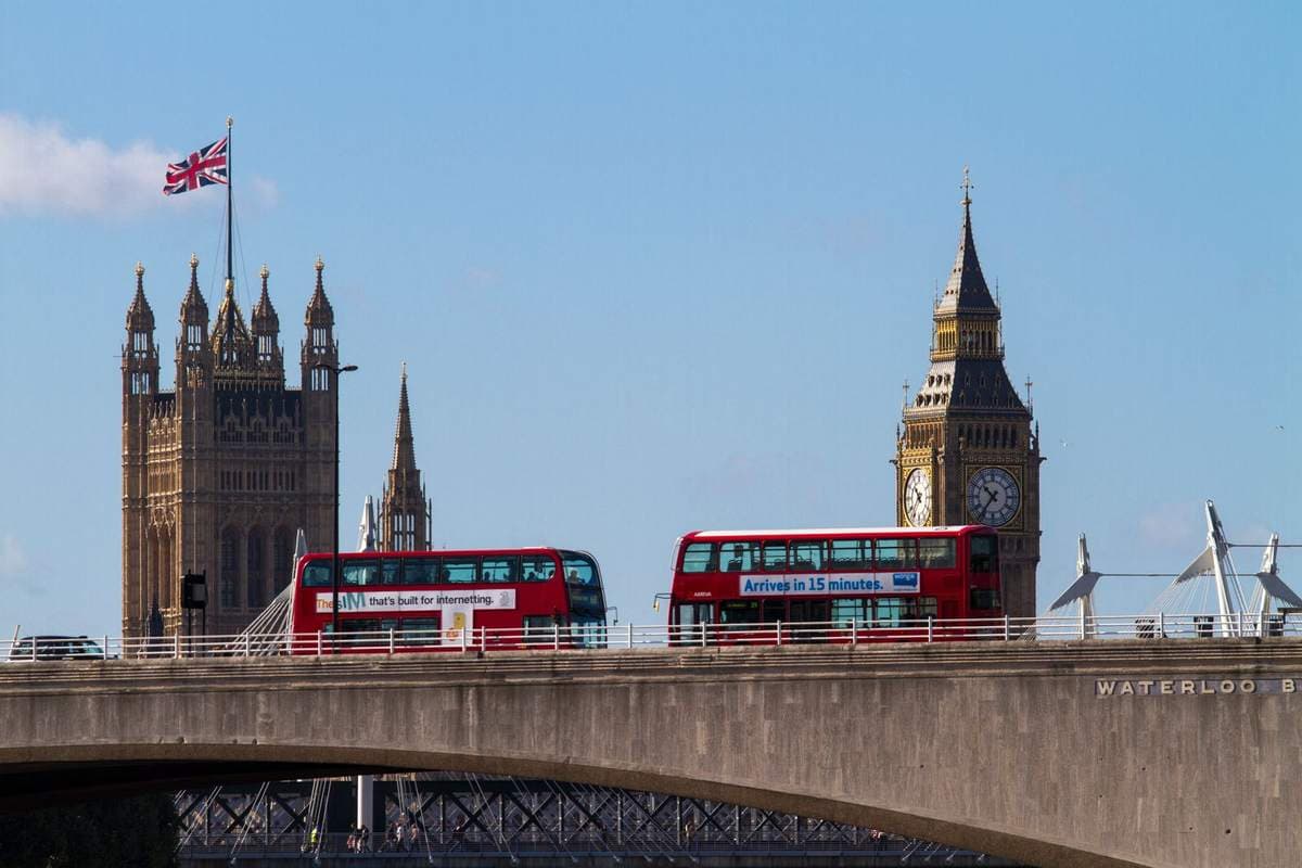
At street level, London photography runs on a formula so reliable it has become a genre: the scene rendered in muted greys — stone, fog, wet pavement — with one red element carrying the accent. A bus, a telephone box, a post box, a guard’s uniform at a distance. The formula works because the red is never the subject; it is punctuation inside a grey sentence, and a room can absorb exactly that much of it beside any neutral scheme.
The failure mode is overdose: three red buses and a phone box in one frame is a theme park. When you choose, count the red. One, placed off-center, in an otherwise honest grey photograph — that is the image that will still look intelligent in ten years. Full-color London is the other honest option: the city in its real, softer spectrum of brick, foliage, painted doors, and river light, which suits traditional rooms better than the grey-and-red graphic register.
Street level: mews, markets, and painted doors
Below the skyline, London is a city of handsome small scales. The mews — cobbled lanes of former stables behind the great houses, now some of the most coveted addresses in the city — photograph as perfect little street portraits: low, colorful, quiet. Terraced streets give the other register: disciplined rows of brick or stucco, and in a few famous districts a deliberate rebellion of painted doors and pastel fronts that has become a subject in itself. Markets bring the working city — stalls, awnings, crowds implied at the edges — and the parks bring its green interior: royal parks with avenues of plane trees and, in the largest, deer moving through bracken like a landscape painting that happens to be inside a capital. Street-level London suits rooms that want charm with structure; it is the city at conversation distance.
Weather is the co-author of all of it. The same street in hard sun looks like anywhere; in the city’s native soft grey, with wet pavement doubling the light, it could be nowhere else. When you browse London street work, favor the images that let the weather in. Atmosphere is not a flaw in the negative here — it is the signature.
The transport poster tradition
London holds one of the great poster archives of the world. For decades the Underground commissioned serious artists to make its posters — not advertisements in the modern sense, but small public artworks: the countryside a train ride away, the zoo, the museums, the river, all rendered in confident flat color with lettering as part of the design. Vintage transport posters carry that double identity still: they are art about travel made by a transport system that treated design as a civic duty. As wall art they bring color discipline, wit, and a graphic register that sits comfortably beside books, desks, and dark wood. Railway posters of the wider country — coast and county scenes in the same tradition — extend the shelf for rooms that want the style without the city itself.
Map art: the city as a document
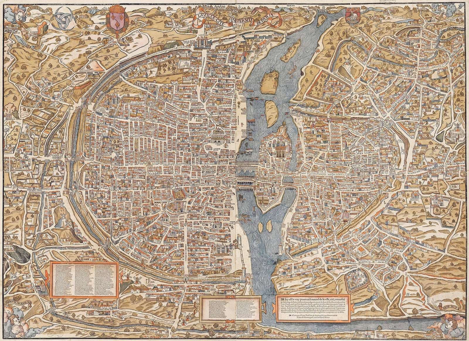
London is also one of the world’s great mapped cities, centuries of cartographers recording its growth street by street, and historic London plans make distinctive wall art: dense, beautiful documents that reward a lifetime of close looking. Map pieces belong to the broader map art family, and London is arguably its richest single subject — the river alone, snaking through an old plan, is composition enough. A framed historic plan over a desk or along a hallway turns the wall into an archive you can read a few streets at a time.
Choosing among the registers
A simple way to decide is by the room’s existing temperature. A room that runs formal — dark furniture, books, a desk that means it — takes the posters and the maps, London’s documentary side. A room that runs modern and pale takes the grey-and-red photograph or the wide river skyline, the graphic side. A room that runs warm and domestic takes the full-color street: painted doors, market awnings, park green. The mistake to avoid is mixing registers tightly — a jokey red-bus print beside a solemn historic map undercuts both. One London per room is not a limitation; it is how the city itself behaves, district by distinct district. It is the local version of the larger question — what your walls say before any single picture is picked — and the series takes that question up in full in its subject guide.
London wall art after dark
One more register rewards attention: the city at night and in fog. London’s darkness is not black but amber and blue — lamps haloed in river mist, lit windows along the embankment, the skyline reduced to a scatter of gold over slate. Night and fog images are the most painterly of London photographs, the closest the camera comes to the city’s long tradition of atmospheric painting, and they suit the rooms of evening: dining rooms, dens, bedrooms that take their drama quietly. If the daytime registers feel too documentary for your walls, the fog is where London becomes pure mood — and where the single red accent, a bus crossing a bridge in the murk, does its finest work.
Where London hangs
A note on scale for the documentary pieces: posters were designed to be read at a platform’s distance and maps at a desk’s, and both suffer when shrunk to souvenir size — the lettering and the street names are the art. Hang them at sizes where a passerby can actually read a line or trace a street, which usually means the middle sizes and up, with the map given the largest wall of the group. The skyline, being atmosphere rather than text, obeys the opposite rule and can go as wide as the furniture beneath it invites. The home office and the study are London’s natural rooms: posters and maps keep company with books and work, and the grey-and-red register flatters dark wood, leather, and library colors. Hallways take the poster sets well — a run of three at matching frames turns a passage into a small exhibition of the city’s graphic history. In living rooms, the wide river skyline is the statement piece; keep the street-level novelties out of the main room unless the single-red rule is strictly kept.
London wall art closes the three city portraits in this series — Paris wall art is the soft-light one — and its lesson is the subtlest: a city does not need sunshine or saturation to hold a wall — it needs a palette with a point of view and one accent, used once. Grey, in London’s hands, was never the absence of color. It is the color of stone, river, and weather, and a room hung with it gains what the city itself has in surplus: depth, history, and calm.
More in Subject Guides



Continue exploring: Subject Guides guides · All guides