

Modern Farmhouse Wall Art: Rustic, Restrained
Barns and botanicals stay, clutter goes: the test is whether a quiet, edited piece would still work in a room that is almost white.
Key Takeaways
- Apply the two-part test to every piece: the subject comes from the farm, the treatment comes from modern design — simplified image, disciplined palette, and air around the subject.
- Hold the narrow palette: warm whites, warm greys, black as punctuation, and one desaturated green accent; no saturated primaries, jewel tones, or gloss inside the images.
- Tame the sign to one per wall saying one thing, in simple serif or clean hand-style lettering, black or charcoal on white or pale wood.
- Use thin black frames for graphic snap and light natural wood for warmer subjects, distributed as chapters not a pile — and nothing distressed, because the worn look belongs to rustic.
- Let the farm appear as subject, never as costume: one large, beautifully printed barn says more than a dozen novelty objects, and gift-shop literalism is the warning sign.
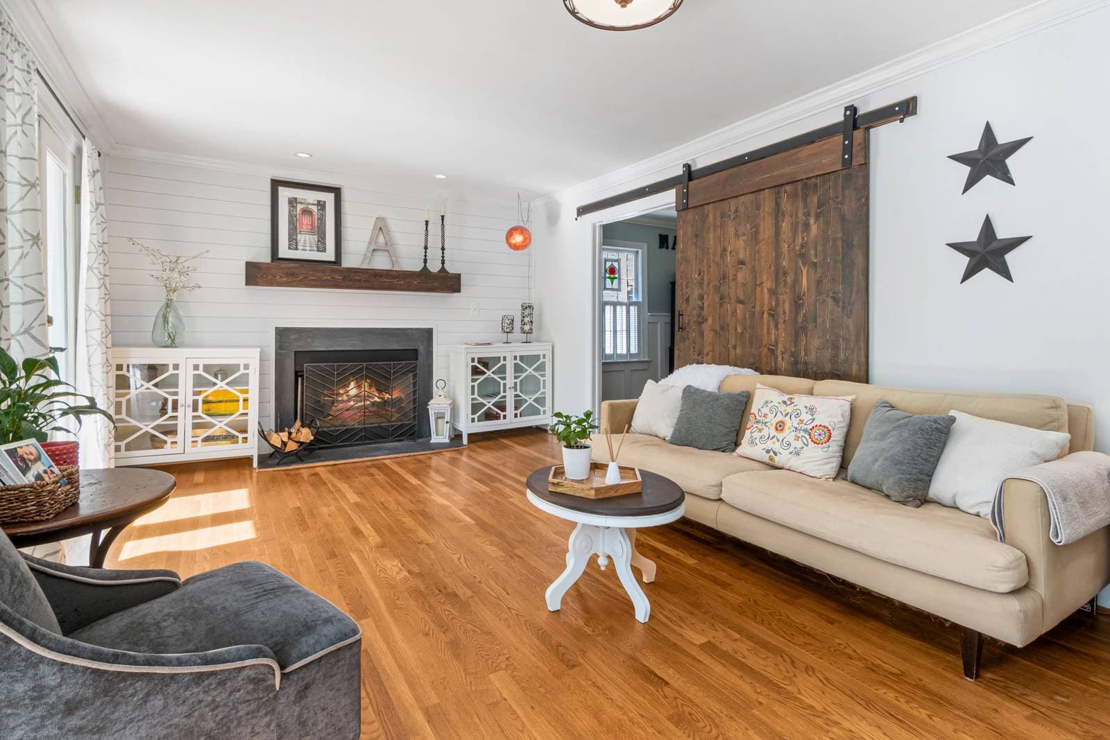
Modern farmhouse is a negotiation that succeeded. On one side sits the farmhouse inheritance — barns, botanicals, hand-lettered signs, the whole warm vocabulary of rural life. On the other sits everything a modern eye has learned: restraint, neutral palettes, clean lines, empty space used on purpose. Modern farmhouse wall art is what the two sides agreed to: rustic subjects, edited. It rose to prominence in the 2010s as renovation television carried the look into every market in the country, and it has outlasted the fad cycle that usually follows — because underneath the trend, the blend answers a real wish: a home that feels gathered and welcoming without feeling cluttered or old.
Modern farmhouse wall art: farm subjects, modern manners
Every piece that belongs in this style passes the same two-part test. The subject is inherited from the farm: a barn, a botanical study, a farm animal rendered with dignity, windmills, wheat, vintage-style lettering, landscapes with a fence line in them. The treatment is inherited from modern design: the image is simplified, the palette is disciplined to whites, warm greys, black, and one soft natural accent, and the composition leaves air around its subject. A barn photograph at full rustic saturation — rust, algae, patched tin, a yard of incidentals — fails the second half of the test. The same barn, shot quiet and printed calm, passes both. When in doubt, ask of any candidate piece: would it still work if the room around it were almost white? Modern farmhouse art is designed for rooms that nearly are.
The modern farmhouse wall art palette, precisely
The style’s calm is a color discipline before it is anything else, and its range is narrower than it looks. The ground is white — but the warm whites: cream, linen, and chalk rather than blue-white gallery tones, because the subjects are organic and cold whites make them look like specimens in a lab. Over that ground run warm greys and greiges, the colors of unpainted plaster and weathered board bleached by sun. Black serves as the style’s punctuation — in frames, lettering, and the occasional iron-dark accent inside an image — used the way a serif uses a period: small, frequent, and structural. The single living accent is usually green, in the desaturated register of herbs and eucalyptus, borrowed directly from the botanical subjects themselves.
What the palette excludes defines it as much: no saturated primaries, no jewel tones, nothing glossy or metallic inside the images. This is why farmhouse walls combine so safely — nearly any two pieces chosen inside the palette will agree — and why a single out-of-palette piece stands out so loudly. If you fall for something louder, give it a room of its own rather than diluting the scheme around it; the style’s serenity is a system, and systems are easier to keep than to repair.
Typography: the sign, tamed
No element of the style is more recognizable — or more parodied — than the farmhouse sign, and the modern version survives by discipline. The family of typography wall art narrows here to a few strict habits: short texts, usually one line; lettering in simple serif or clean hand-style scripts, never novelty fonts; black or charcoal on white or pale wood, with contrast doing the decorating. A single word can carry a wall when it is set large and left alone. What the modern treatment removes is the clutter around the message — the distressed boards stacked three deep, the saying competing with two other sayings. One sign per wall, saying one thing, is the difference between the style and its souvenir-shop imitation.
Botanicals and the quiet subjects
The second pillar of the modern farmhouse wall is the botanical study, borrowed from the old engraved plates but redrawn for calmer rooms: a single stem, a herb sprig, an eucalyptus branch, rendered in soft green-grey or simple line on a white ground. These work in sets — two, three, or four in matching frames — because their repetition is rhythmic rather than busy, and they are the style’s most versatile citizens, at home above a sideboard, down a hallway, or flanking a bed. Farm animal portraits belong to the same quiet register: one cow, one rooster, photographed or painted plainly and given a large white margin, reads as graphic art rather than barn decor. The rule across all of it is the white ground and the single subject — the farm, distilled to specimens. Let the same botanical impulse run warmer and more romantic — gardens, wildflower meadows, vintage plates in soft light — and it becomes cottagecore wall art, covered in its own guide.
Frames and finishes: quiet hardware
Framing in this style follows a two-member cast: thin black and light natural wood. Black frames give botanical and typography pieces their graphic snap against white walls — they are the modern inheritance showing. Light wood frames soften toward the farm, and suit the warmer subjects: animal portraits, landscapes, anything with cream in its ground. A wall may use both, but it should distribute them like a pattern rather than a pile — all black over the sideboard, say, wood down the hall — so the mixture reads as chapters, not indecision. Mats, when used, are wide and white; glass, when the room is bright, should be the non-glare kind if it is an option, because the style’s soft images lose their softness under a sheet of reflections. Nothing in the framing should be distressed. The worn look belongs to rustic; the farmhouse frame is a new frame, honestly finished, and its cleanliness is half the style.
What to leave out: theme drift
The style’s popularity bred a souvenir version of itself, and knowing its marks keeps a wall on the right side of the line. The warning signs are literalism and repetition: roosters on the art, the towels, the canisters,and the clock; a saying in every room, each louder than the last; every surface distressed whether or not distress tells any story. The modern half of the style exists precisely to refuse this. Its rule of thumb is that the farm should appear as subject, never as costume: one barn, beautifully printed, says more about loving rural life than a dozen novelty objects stamped with barn shapes. If a candidate piece would look at home in a gift shop’s farmhouse aisle, it is probably the imitation. The genuine article tends to be quieter, larger, and better drawn.
The boundary with rustic
Rustic is this style’s parent, and the two are confused constantly, so the line is worth drawing precisely. Rustic keeps the weather in: rougher materials, deeper and more saturated earth colors, subjects shown in their working mess. Modern farmhouse takes those same subjects through an editor — surfaces smooth, palette lightened toward white, each wall given fewer, larger, calmer pieces. A room can love both, and many do, but a single wall should usually choose: rustic density and farmhouse air fight each other at close range, each making the other look like a mistake. Kitchens and dining rooms, where the style was born, are the rooms where the edited version most clearly wins — they are working rooms that benefit from visual calm, and their hard surfaces take the softening that botanical and typography pieces give.
Hanging it in a kitchen, step by step
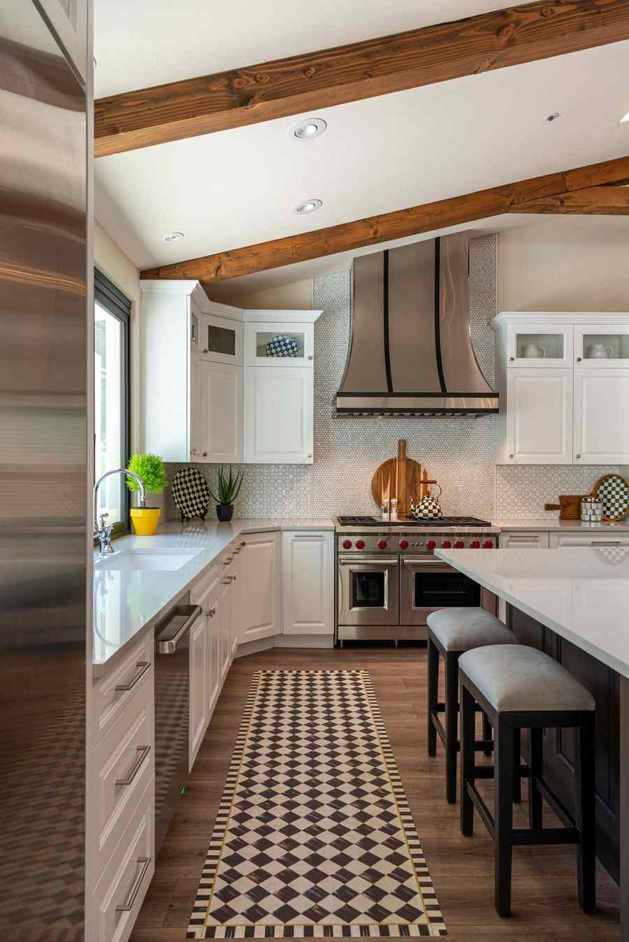
The kitchen is the style’s home ground, so it deserves a practical pass. Start above the largest uninterrupted surface — the wall over a dining table, the run above a banquette, the stretch beside the pantry door — rather than squeezing pieces into the fragments between cabinets, where art reads as leftovers. Choose one anchor: a typography piece or a large botanical, sized to the furniture under it. Then, if the wall still asks for company, add the pair or trio in matching frames at matching height, and stop. Keep every frame in the same narrow family — black, or light natural wood — and let the white grounds of the prints do the brightening that the room’s palette promises.
Outside the kitchen, the same grammar serves entryways (one sign, one bench, nothing else required), dining rooms (botanical sets above a sideboard), and bedrooms that want farmhouse softness without a single distressed board. Choose modern farmhouse wall art when you love the rural subjects but live — happily — in the present tense: the barns and botanicals stay, the clutter goes, and the walls get to feel both welcoming and calm, which is the whole negotiation, settled in your favor. The style sits in the warm family of this series’ plain-language field guide to wall art styles, alongside rustic, bohemian, and cottagecore.
More in Style Guides
Continue exploring: Style Guides guides · All guides