

Mountain Wall Art: Misty or Graphic Peaks
Peaks can give a room its centre of gravity — or make it loom. Misty or graphic, valley or summit: here is how to choose the version your wall can hold.
Key Takeaways
- Pick your family first: misty, layered ridges read as calm and suit bedrooms and busy rooms, while graphic, hard-edged peaks act as bold landmarks for plain or sterile walls.
- Do not print mountains small — reduced to postcard size a peak becomes a souvenir and loses the sense of scale that is the whole point of the subject.
- You are really choosing weather: a summit clearing from storm cloud is drama, the same peak under an empty noon sky is a settled portrait, and a cloud cap adds mystery but removes the summit itself.
- Decide your standpoint: a valley view looks up and feels like aspiration and shelter for rooms where people sit low, while a high view looks across and down and suits walls people stand before.
- Keep one peak per view and give it the tallest story on its wall, with low, horizontal furnishings beneath it, so tall shelving or another large vertical subject does not compete with it.
Mountains are the landscape subject with the volume turned up. Where a meadow soothes and a coastline opens, a peak asserts — it is the largest object in any view it enters, and it brings that scale indoors with it. That is exactly why mountain wall art rewards a little thought before it rewards a wall: the right mountain picture can give a room its center of gravity, and the wrong one can loom. This guide covers the two great families of mountain images — misty and graphic — the scale the subject asks for, and the rooms and materials it pairs with best.
Mountains live inside the wider landscape family, and everything true of landscapes is true of them; what follows is only what peaks add on top of the general case: altitude, weather, and the strange calm of looking at something that does not need you at all. The general case itself is laid out in our landscape wall art guide.
Misty mountain wall art: the quiet kind
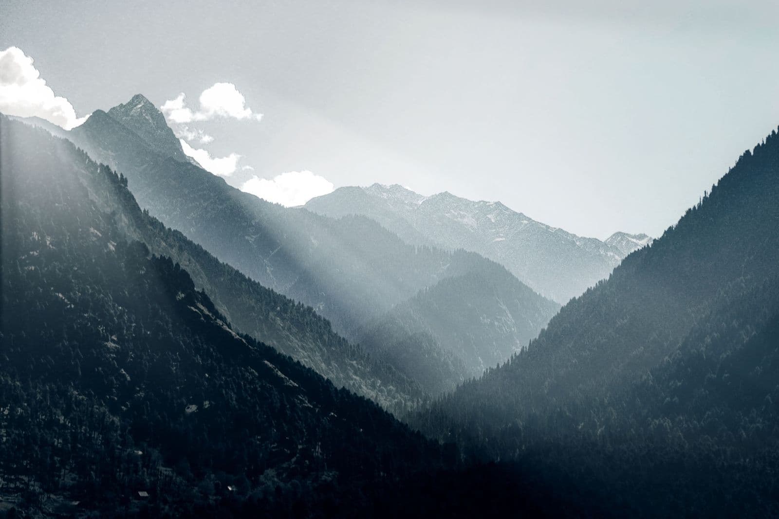
The most popular mountain images of the last decade are the soft ones: ridge behind ridge dissolving into fog, each layer paler than the last, until the farthest peak is barely a rumor of blue-grey. This is aerial perspective pushed to its limit — the atmosphere is not in front of the subject, it is the subject. Misty mountains read as calm because they contain almost no incident: no climbers, no villages, barely any detail to catch the eye, so the eye rests.
Choose mist when the room’s job is recovery. Bedrooms are the natural home — the image lowers the pulse rather than raising it, and its tonal quiet does not fight bedding, curtains, or lamplight. Misty images also forgive busy rooms: where furniture and pattern already supply the detail, a fogged ridge line above them works like a held breath. The trade is presence — a misty mountain will never be the room’s exclamation mark, and in a large, formal space it can feel like it is politely leaving.
Graphic mountain wall art: the bold kind
The other family treats the peak as design: hard-edged triangles, strong diagonals, snowfields cut against dark rock, sometimes reduced to near-abstraction in prints and posters. Graphic mountains descend from travel-poster art, and they carry a poster’s virtues — instant legibility from across the room, a confident silhouette, color that behaves like an accent. A single graphic peak can organize a wall the way a piece of sculpture organizes a shelf.
Choose graphic when the room needs a landmark: a plain wall in a modern interior, a workspace that runs a little sterile, a hallway that currently funnels people through without giving them anything to look at. The caution is volume — bold geometry is loud at large sizes, and two graphic mountains in one sightline will compete like rival monuments. One peak per view is a good rule; a range rendered graphically can count as one if its silhouette reads as a single rhythm.
Scale: peaks want room to be tall in
More than any other subject, mountains are diminished by being printed small. A peak reduced to a postcard becomes a souvenir: charming, but the whole point of the subject — its indifference to human scale — is lost when you can cover it with one hand. Mountain art earns its effect from the viewer feeling briefly small, and that requires the image to occupy a generous share of the wall, ideally with the summit given air above it rather than cropped by the frame’s top edge. Cropping matters here: compositions that cut the peak off read as deliberately modern and close-up; compositions that include the whole summit with sky above read as vista. Both work; know which one you are buying.
Shape follows composition. Ranges want width — a panoramic frame lets a ridge line run the way it runs in the world. A single dramatic peak, a spire or a horn, can hold a vertical or square format and will pull a room’s eye upward, a useful trick where ceilings are low. Multi-peak photographic series, hung as a sequence, suit long walls and staircases, where the repetition reads as a range rather than a repeat.
Weather is the co-author
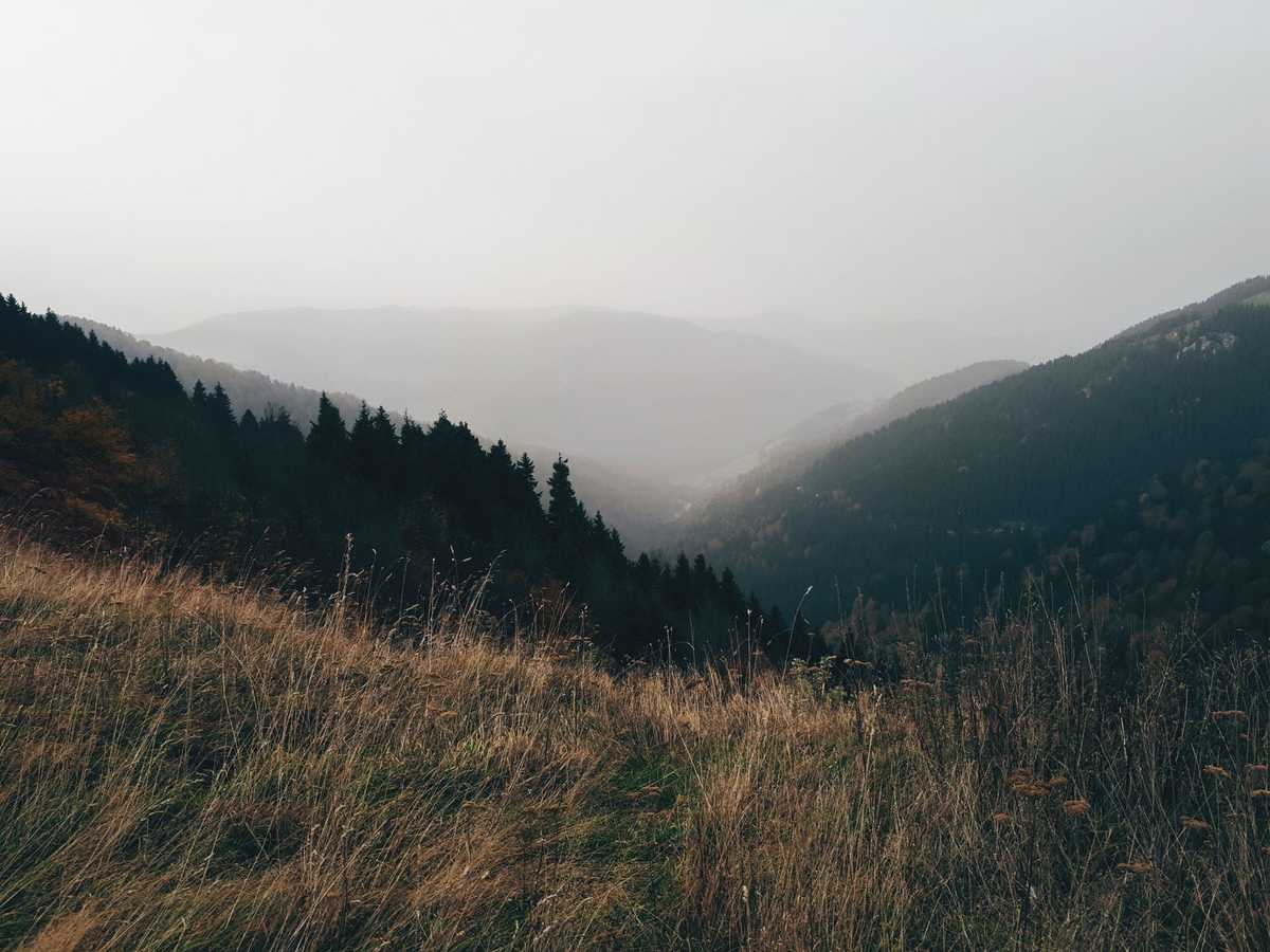
No mountain image is only a picture of a mountain; the weather at the moment of capture is half the composition. A summit clearing from storm cloud, black rock against torn white, is drama — the mountain as event. The same peak under an empty noon sky is a portrait: settled, legible, almost architectural. Snow redraws every ridge, softening geology into pure form and adding the brightest whites a wall can hold; a summer version of the same view is greener, busier, friendlier. When you compare two pictures of similar peaks, you are really choosing between weathers, and between the moods those weathers bring indoors: aftermath and clearing, or calm and permanence.
Cloud deserves special attention because it decides how much mountain you actually get. A cap of cloud on the summit adds mystery and scale — the peak continues into weather you cannot see — but it also removes the summit itself, which some buyers later miss. If the point of the picture is that mountain, a recognizable one with a name and a trip attached, choose the clear-day portrait. If the point is mountains in general, weather is your friend and a half-hidden peak will outlast a postcard view. Named peaks with trips attached are also the heart of national parks wall art, where the poster tradition and the photograph meet.
Valley view or summit view?
Mountain images are taken from two great standpoints, and they put the viewer in different bodies. The valley view looks up: the peak towers, the viewer is small, the feeling is aspiration and shelter at once — you are in the world, under it. The high view — from a pass, a ridge, or the air — looks across and down: ranges unfold like a map, the viewer is briefly a surveyor or a bird, and the feeling is command and comprehension. Valley views suit rooms where people sit low and linger; high views suit walls people stand before, and rooms that want horizon rather than shelter. Most walls are improved by knowing which of the two they are being offered. Where the valley floor is wooded rather than bare, the companion subject is forest art and its enclosed green depth, the landscape family’s most interior mood.
Color at altitude
Mountain color is mostly geology and light. The geology gives you greys, blue-greys, and the warm browns of lower slopes; the light gives you the famous extremes — the rose-gold of alpenglow on snow at dawn and dusk, and the hard white of midday on a glacier. Alpenglow images are the warmest mountains available and the easiest to live with in rooms short on natural warmth: they bring the palette of sunset into rooms that face the wrong way for the real thing. Blue-hour and winter images run cool and clean; they flatter white, grey, and pale-wood rooms and can feel austerely beautiful or simply cold, depending on what surrounds them.
Black-and-white mountain photography deserves its own mention. Stripped of color, a peak becomes pure structure — ridge, face, cornice, shadow — and the great mountain photographs of the twentieth century were nearly all monochrome. A black-and-white peak fits almost any palette, reads as serious rather than decorative, and pairs especially well with textural rooms: wool, leather, rough plaster, dark wood.
Pairing mountains with a room
Mountain wall art is the natural art of wood-and-wool rooms: cabins, obviously, but also any interior leaning on natural materials and neutral tones, where the picture continues the palette instead of interrupting it. In the bedroom — the misty ridge’s best room — hang the calmest version you can find and let it be the last thing the day shows you. In a living room, a single large peak over the main seating gives the room a geography; in an office, a graphic summit behind the desk is the classic emblem of the long climb, and there is no shame in its being a cliché, because it happens to be true.
What to avoid: competing altitudes. A mountain picture hung beside tall shelving, a high headboard, or another large vertical subject loses its summit logic. Give the peak the tallest story on its wall, keep the furnishings beneath it low and horizontal, and the room will borrow the mountain’s best quality — the feeling that some things are big, old, and entirely unbothered, and that a room can hold a little of that.
Start, as always, with the wall and the mood you want from it. Mist or graphic, valley or summit, snow or summer green — the mountain you choose is the weather your room will keep, and chosen deliberately, it is the most durable subject in the whole landscape family.
More in Subject Guides
Continue exploring: Subject Guides guides · All guides