

Forest Wall Art: Green Depth and Air
Other views put you in front of them; a forest puts you inside one. Pick the kind of enclosure you want, then check its layers and its greens before hanging it.
Key Takeaways
- Choose your forest by feeling: misty pines are the calmest, a sunlit path is the most welcoming, dense canopy is the immersive extreme, and pale groves of birch or beech read almost like architecture.
- Judge depth by layering, not distance: convincing forest images keep a clear near, middle and far in overlapping trunks and light, and a print whose darkest quarter still separates trunks will hold its depth on the wall.
- Compare the picture's dominant green with your room's and keep both on the same side of the blue-yellow line, and picture the image at 8 p.m., because warm lamplight yellows every green in the frame.
- Hang it so the picture's implied floor sits near your real eye level; a forest floating high on a wall, with its ground near the ceiling, breaks the spell and becomes treetops.
- Favour matte surfaces such as canvas for fog and canopy, because reflections remind the eye it is looking at an object; glossy finishes suit only the sunlit path, where sparkle reads as light through leaves.
Every other landscape subject puts you in front of a view. A forest puts you inside one. There is no horizon to look toward and no vista to survey — the trees surround the standpoint, the canopy closes overhead, and the depth runs between trunks rather than off to a vanishing point. That interior quality is what forest wall art sells, and it is why a good forest picture can make a room feel sheltered and oxygenated at once, while a weak one is just a green rectangle. This guide covers the main families of forest imagery, the many greens involved, and how to make the depth read on a real wall.
Forests belong to the landscape family, but where a landscape’s job is distance, the forest’s job is enclosure — the following is about choosing the kind of enclosure you want to live in. The wider family’s general rules — horizon, layers, and light — are covered in our guide to landscape wall art.
Forest wall art: four forests, four feelings
The misty pine forest is the modern classic: straight conifer trunks rising into fog, each rank paler than the one behind, almost no floor detail. It is the calmest forest — nearly abstract, mostly vertical rhythm and soft grey-green air — and it suits rooms that need quiet more than they need interest. The sunlit path is its opposite in spirit: a track or clearing drawing light into the trees, dappled shade, the suggestion of a walk about to happen. Path pictures give the eye a way in and a way through; they are the most welcoming forests and the easiest to live with at large sizes.
The dense canopy — photographed looking along a wall of layered green or up into overlapping crowns — is the immersive extreme: maximum enclosure, maximum green, a picture that behaves like planting a thicket indoors. It energizes plain rooms and can overwhelm small or cluttered ones. And the grove — birch, aspen, beech — is the graphic forest: pale trunks in rhythm against leaf color, orderly rather than wild, beloved of modern interiors because its verticals behave almost like architecture. In autumn, groves turn gold and the same picture becomes the warmest forest available.
Depth without a horizon
Because a forest image has no distance to measure against, its depth is built differently: by overlapping trunks that stair-step from dark near bark to pale far stems, by light falling in shafts or pools, and by the floor — ferns, moss, leaf litter — tilting away under your eye. When you judge a forest image, judge those layers. A photograph in which every trunk is equally sharp and equally lit reads flat no matter how beautiful the woods were; the convincing forests always keep a clear near, middle, and far, even if the far is only fog. The ferns in that floor layer have a close-up tradition of their own in botanical plates and leaf studies, where one plant at a time gets the attention the forest gives to hundreds.
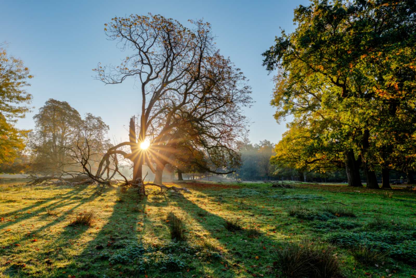
Scale works differently too. A landscape’s effect often grows with width; a forest’s effect grows with height and coverage, because the illusion is of standing among trees, and trees are tall. Forest images reward being hung so their implied floor sits near the room’s real floor-line of vision — a forest floating high on a wall with its ground somewhere near the ceiling breaks the spell and becomes treetops. Let the picture’s ground meet your eye level as it would outdoors, and the room briefly has woods in it.
The greens in forest wall art, honestly
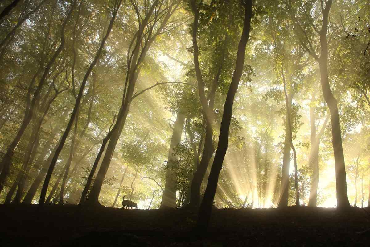
Green is the hardest color in decorating: it is never one color, and forest art contains dozens — blue spruce greens, yellow new-leaf greens, the near-black of shaded understory, the acid brightness of moss after rain. Two practical consequences follow. First, forest art rarely clashes outright — nature’s greens evolved together and sit together — but it can argue with a room’s existing green. A blue-green forest against yellow-green upholstery will make one of them look wrong; compare the picture’s dominant green to your room’s dominant green, and keep them on the same side of the blue-yellow line. Second, forest images change more than most art between daylight and lamplight, because warm evening light yellows every green in the frame. Check a candidate image in your mind at 8 p.m., not just noon.
If your room is already green-rich — plants, green walls, garden views — a forest picture still works, but choose one with strong structure (grove verticals, a bright path) so it reads as art rather than as more foliage. If your room is green-starved — a city apartment, a windowless den — the dense canopy earns its keep: it is the single subject that most directly answers a craving for the living world.
Surfaces that keep the spell
A forest illusion depends on softness, and surface finishes can help or hurt it. Matte surfaces — canvas above all — let the depth stay misty and the greens stay deep; reflections are the enemy of enclosure, because a reflected lamp or window reminds the eye it is looking at an object. Very glossy finishes suit the sunlit path, where sparkle reads as light through leaves, but for fog and canopy, choose the quieter surface every time. Print quality shows in forests too: cheap prints crush the shadow layers into uniform dark green, and the near-far layering this subject lives by is the first thing lost. Judge a forest print by its darkest quarter — if you can still separate trunks there, it will hold its depth on the wall.
The seasons inside the forest
A forest is the most seasonal of subjects, and the season you choose sets the picture’s energy. Spring forest is the lightest: new leaves in near-yellow green, light reaching a floor that will be shaded out by June, sometimes blossom on the understory trees. It suits rooms that wake up early and rooms that need cheering in February. Summer forest is the deep one — full canopy, blue shade, maximum enclosure — and it cools a hot, bright room by suggestion. Autumn forest is the decorator’s forest: the canopy turns to gold, rust, and wine, and the picture starts behaving like an accent color, so choose it against your palette rather than in ignorance of it. Winter forest is the starkest and, to some eyes, the finest: bare architecture of branches, snow simplifying the floor to white, the structure of the wood exposed. A winter forest is the closest this subject comes to minimalism, and it hangs beautifully in rooms that find the green versions too much.
Painted forests: the older spell
Long before the camera, painters went to the woods on purpose. The nineteenth-century Barbizon painters in France made the Forest of Fontainebleau famous by treating ordinary oaks and clearings as worthy of the seriousness once reserved for cathedrals, and their example — paint the real wood, in real weather, at human scale — still defines what a painted forest feels like: observed rather than staged. Painted forests soften a room differently from photographs. The brushwork breaks the detail, the greens are mixed rather than captured, and the result sits easily beside traditional furniture and book-lined walls where a crisp photograph might feel too documentary. Photographs answer the wish to stand in a real place; paintings answer the older wish to have the wood remembered. Both are legitimate spells; know which one your room is asking for.
Where forests belong
The forest’s native room is the one where you go to think. In a home office, a forest behind or beside the desk provides the soft, undemanding view that eyes seek between tasks — green, deep, and asking nothing — and it reads composed and calm on a video call. Bedrooms take the misty pine and the quiet grove; bathrooms take the fern-rich, rain-lit forest, which turns a daily routine briefly sylvan; hallways, which nobody can furnish, become a walk in the woods with a single path picture given the wall to itself.
Forests pair naturally with the materials of their own world — wood above all, then wool, linen, stone, and leather — and they are the rare subject that improves with living plants nearby, real green answering pictured green across the room. They also behave unusually well opposite windows: where a view of actual trees exists, a forest picture on the facing wall completes a circuit, and where the window shows only brick and traffic, the picture becomes the view the window failed to provide. Choose your forest wall art the way you would choose a wood to walk in: misty for rest, sunlit for welcome, dense for immersion, orderly for calm with structure. Then give it an uncluttered wall and its own pool of quiet, and let the room breathe in. And if you are still weighing forests against the other families, the subject-by-subject overview lays them side by side.
More in Subject Guides

Continue exploring: Subject Guides guides · All guides