

Color & Decorating Fundamentals
How to Choose Wall Art Colors That Work
People freeze not over the picture but over its relationship to everything else. Naming that relationship first makes the individual choice much easier.

Key Takeaways
- Choose the relationship first: decide whether the art should match the room's color family for calm, echo one or two smaller colors already in the room, or contrast with the room to become its focal point.
- Use the sixty-thirty-ten idea loosely: roughly sixty percent a dominant color, thirty percent a supporting color, and ten percent an accent, with art usually working best as part of the smaller shares rather than matching the dominant sixty percent.
- Watch saturation and undertones together: most color regrets are saturation regrets, and whites, greys, and beiges all lean warm or cool - test candidate colors against the purest white thing you own, in the room's own light, to see the lean.
- Test with what you already own: drape a scarf, cushion cover, book jacket, or item of clothing in the candidate color where the art will hang, tape a paper outline of the art's dimensions beside it, and live with both for a day.
- Across several pieces, either distribute an accent color in small amounts through the set or concentrate nearly all the color in one focal piece; two pieces competing at equal intensity in unrelated palettes is what fails.
How to choose wall art colors is where most decorating projects stall. People who happily choose a sofa freeze in front of a print, because the art feels exposed — it is the one thing in the room that exists purely to be looked at. The good news is that color in art obeys a few learnable relationships. You do not need a design education; you need to decide which of three relationships you want between the art and the room: matching, echoing, or contrasting.
How to choose wall art colors: start with your room
Before looking at a single image, take inventory of the room as it is, not as you wish it were. Note the wall color (and whether it leans warm or cool), the floor, the largest pieces of furniture, and the textiles — rug, curtains, cushions — that carry pattern or color. These are the fixed points your art has to live with. A photograph on your phone, taken in daylight, is the simplest inventory of all: rooms read differently in a picture than they do from inside them, and the picture is what your art will join.
The sixty-thirty-ten idea, used loosely
Decorators often describe a balanced room as roughly sixty percent a dominant color (usually the walls and largest furniture), thirty percent a supporting color (textiles, secondary furniture), and ten percent an accent (small objects, cushions — and art). Treat this as a thinking tool, not a law. Its real lesson is proportion: art usually works best as part of the smaller shares of a room's color, which is why a single bold piece can transform a neutral room without overwhelming it — the effect at the heart of wall art for neutral rooms, where one statement, quiet texture, or tone on tone does the work — and why art that tries to match the dominant sixty percent often disappears into the wall.
Strategy one: match — the tonal room
Matching means choosing art in the same color family as the room: layered blues in a blue-grey room, warm creams and taupes in a beige one. Done well, it produces calm, cohesive rooms where the art feels inevitable. Monochrome and near-monochrome art — a misty landscape in a grey room, a sepia photograph in a brown one — is the sophisticated end of this strategy.
The risk is flatness. When everything matches, nothing leads the eye, and the room can feel like a showroom photograph rather than a place. The fix within the strategy is contrast of tone rather than color: in a pale room, a matching-family piece that is noticeably darker gives the eye somewhere to land while keeping the palette serene.
Strategy two: echo — the forgiving middle path
Echoing means the art picks up one or two colors that already exist somewhere in the room — not the wall color, but the smaller notes: the rust in the rug, the green of a plant and a cushion, the brass of a lamp echoed by a golden sky in a landscape. The art and the room are not wearing the same outfit; they are wearing one shared accessory, and that is enough to make them look related.
Echo is the most forgiving strategy and the best starting point for most people, because it tolerates imprecision. The echoed color does not need to match exactly — a family resemblance is fine, and often better than a perfect match, which can look calculated. Photographs and landscapes are natural echo machines: a single coastal scene carries blues, sands, whites, and weathered greys, any one of which can pick up something in your room.
Strategy three: contrast — the deliberate jolt
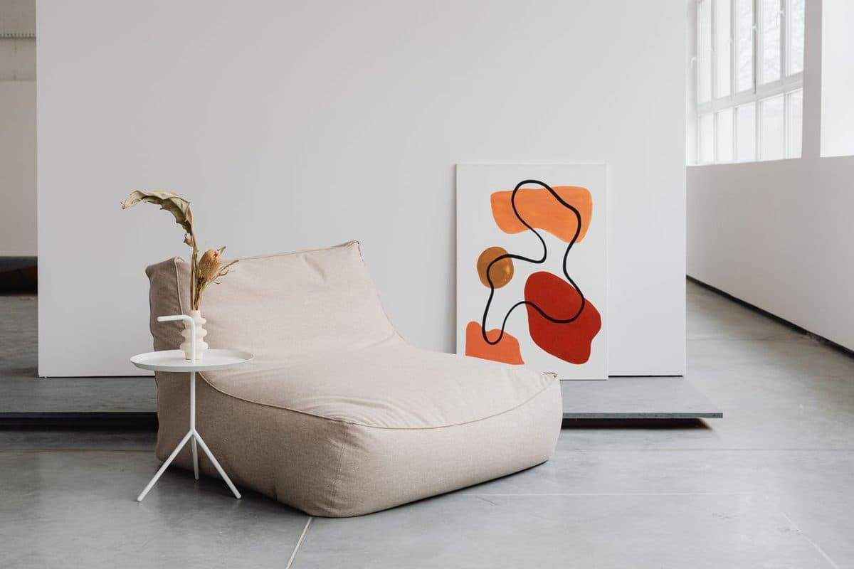
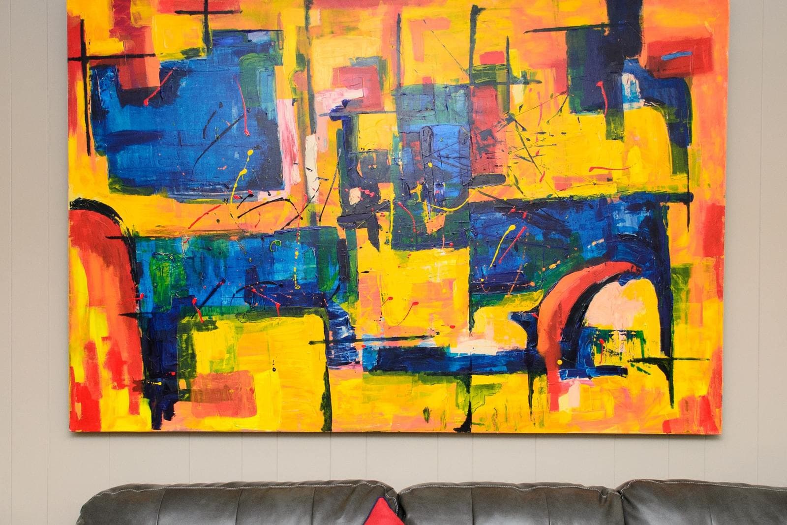
Contrasting means choosing art whose colors stand opposite the room's: a vivid abstract in saturated orange over a cool grey sofa, deep teal art in a warm white room. Contrast is how a single piece becomes the room's focal point, and it is the strategy behind most "wow" photographs of interiors.
Two cautions keep contrast sophisticated rather than shouty. First, limit it: one contrasting piece per wall, with the rest of the room staying quiet, reads as confidence; five competing pieces read as an argument. Second, mind the scale — a contrasting color in a large piece carries far more weight than the same color in a small one. If you love a bold image, giving it a big wall and calm surroundings is almost always the right call. Bold abstract work is the natural home of this strategy, which is why browsing abstract wall art with your room's palette in mind is such a useful exercise.
Saturation: the dial most people forget
Color has volume as well as hue. A muted, greyed version of a color and its vivid, saturated twin behave like different personalities in a room: the muted one settles in, the vivid one performs. Most color regrets are saturation regrets — the right blue, but twice as loud as the room. When you find art you love that feels too intense, the fix is often not a different image but the same family at lower volume: the mistier landscape, the dustier abstract. And the reverse serves quiet rooms that feel flat: if everything is tasteful and nothing is noticed, the missing ingredient is usually saturation somewhere, and one piece of art is the safest place to add it.
Undertones: the trap under everything
Most "the color looked right in the shop" failures are undertone failures. Whites, greys, and beiges all lean warm (pink, yellow, cream) or cool (blue, green, violet), and a warm-toned print on a cool-toned wall will look faintly wrong in a way that is hard to name. The test is simple: hold the candidate colors against the purest white thing you own, in the room's own light, and the lean becomes visible. When art and room share an undertone family, even strongly contrasting colors sit comfortably together.
Test with what you already own
You do not need swatch books to test color. Drape a scarf, cushion cover, book jacket, or item of clothing in the candidate color over the back of a chair where the art will hang, and live with it for a day. It occupies the same visual slot, catches the same light, and costs nothing. Tape a paper outline of the art's dimensions beside it while you are at it, and you have tested size and color together — the two decisions that actually determine whether a piece belongs.
When the walls cannot change
Renters, and anyone living with a fixed palette they did not choose — landlord white, a builder's grey, inherited wood paneling — are often told art is their one lever for color. That is true, and it shapes the strategy: when the room's dominant color is imposed, art usually works hardest as the echo and the accent at once. Choose pieces that carry two or three of the colors you wish the room had, at meaningful scale, and let textiles repeat one of them. The wall stays the landlord's; the color story becomes yours. The one thing to avoid is art chosen to "fix" the wall color by fighting it head-on — a warm-toned print will not warm a cool grey wall, it will just look misplaced against it. Work with the undertone you have and put the energy into the art's own palette.
Distributing color across several pieces
A gallery wall or a set of pieces across a room adds one more decision: how the color is spread. Two approaches both work. In the distributed approach, the accent color appears in small amounts in several pieces, so the eye travels and the room feels woven together — good for eclectic collections and for tying together art bought at different times, the same weaving that mixing art styles in one room achieves by holding one shared thread across unlike pieces. In the concentrated approach, one piece carries nearly all the color and the rest stay tonal; the colorful piece becomes the undisputed focal point and the others become its supporting cast. What fails is the accidental middle: two pieces competing at equal intensity in unrelated palettes. If you notice that happening, demote one of them — to a quieter wall, a different room, or a calmer frame — rather than adding a third to mediate.
Frames, mats, and metals are colors too
The frame is not outside the color decision; it is the picture's nearest neighbor and the room's handshake with it. A black frame adds a graphic note that can supply the contrast a pale image lacks; natural wood repeats the warm tones of floors and furniture and softens almost anything; a wide white mat cools and quiets a vivid piece, giving it air. When a picture feels almost right, changing the frame color is frequently the cheapest route to right — it shifts the balance of the whole arrangement without touching the art itself.
Light rewrites color twice a day
A north-facing room cools every color in it; evening lamps warm them. The print you fell for under bright midday light will live most of its life in softer conditions, so judge candidates in the light the room actually has at the hours you use it. This is one more argument for the echo strategy in dim rooms — colors related to the room shift together as the light changes, while a lone contrasting piece can change character entirely by evening.
How to choose wall art colors: a working method
- Photograph the room in daylight; name its three main colors.
- Decide the relationship: match for calm, echo for safety, contrast for a focal point.
- Check undertones — warm with warm, cool with cool.
- Test the main candidate color in the room for a day, using something you own.
- Choose the piece, then stop second-guessing: all three strategies work when they are chosen deliberately.
Whether you are art-shopping for the living room or any other wall, the process above is the whole secret of how to choose wall art colors: decide the relationship first, and the individual piece becomes an easy choice. Browse with the decision made — in the catalog or anywhere else — and you will find you stop asking "do I like it?" and start asking the much better question: "does it belong here?" That is the question good rooms answer yes to.
More in Color & Decorating Fundamentals

Continue exploring: Color & Decorating Fundamentals guides · All guides