

Color & Decorating Fundamentals
How to Choose a Frame Color: 4 Families
A few inches of molding quietly set a picture's edge, contrast, and temperature. Choosing it by habit gives away most of what a frame can do for a room.
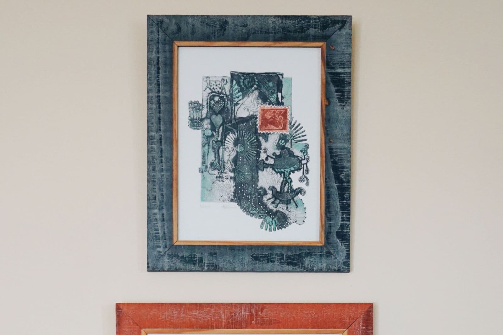
Key Takeaways
- A frame does three jobs: it draws a hard edge between the image and the wall, sets the image's outer contrast, and lends temperature and era - the same print reads modern in chrome, traditional in gilt, and Scandinavian in pale oak.
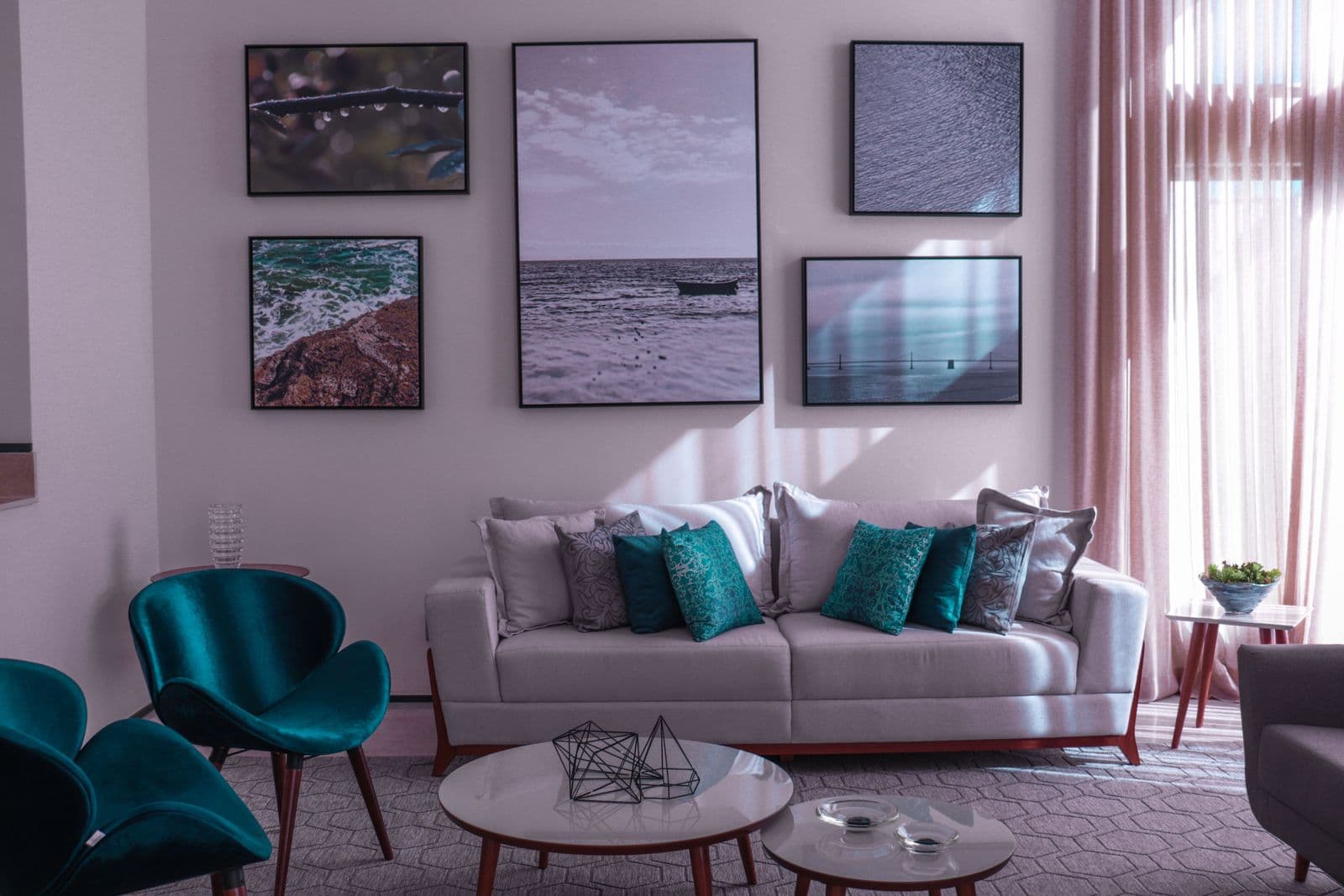
- Black sharpens and modernizes and unifies mixed collections faster than any other finish, white lets bright, airy images breathe on light walls but can wash out pale on pale, natural wood adds warmth and visible grain, and gold warms while silver, chrome, and pewter run cool and spare.
- Match the room by echo, not by copying: let the frame answer one finish already there, such as the floor's undertone, a lamp metal, or hardware, and for wood match the undertone family rather than the exact species or stain of your furniture.
- Mix finishes on one wall under discipline: use a dominant finish with one supporting finish, keep profiles similar in width and mats consistent, and avoid three or more finishes at equal weight, which reads as a sample wall.
- On paper prints the mat is half the decision: a bright white mat freshens and modernizes, an off-white or cream mat warms and traditionalizes, and a dark mat turns the presentation dramatic, so suspect the mat before the frame when a piece feels off.
The frame is the last decision made about a picture and the first one the wall notices. How to choose a frame color is a learnable decision, not a habit. It is a boundary, a contrast setting, and a temperature control in a few inches of molding, and choosing its color by habit — black for everything, or whatever the shop paired it with — gives away most of what it could do. Four families cover nearly every frame you will ever consider: black, white, natural wood, and metal. This guide walks through what each one does to a picture, how to match frames to the room without matching them to death, and how to mix finishes on one wall without starting an argument.
How to choose a frame color: what frames do
A frame performs three jobs. It draws a hard edge between the image and the wall, telling the eye where the picture starts. It sets the image’s outer contrast — a dark frame makes pale passages glow, a pale frame lets dark images expand. And it lends the picture a temperature and an era: the same print reads modern in chrome, traditional in gilt, and Scandinavian in pale oak. The jobs differ by format. On a framed canvas, typically a slim float frame, the molding is a shadow line around a deep edge — quiet, architectural, and exactly the finish compared in canvas vs framed canvas when deciding which finish suits a room. On fine art paper, frame and mat together form a wide presented border, and the color choice carries much more weight. Know which job your format is hiring for before you pick the color.
Black: the sharpening frame
Black is the graphic choice. It underlines, crisps, and modernizes: photography gains punch, line work gains confidence, and pale or misty images gain a spine they may badly need. Black frames also unify mixed collections faster than any other finish, because the strong repeated edge overrides differences in the art. The cautions are two. On a dark wall, a black frame can vanish at the outer edge and leave the image floating oddly — give it a mat or a lighter wall moment to edge against. And on soft, romantic images, black can feel like a shout in a library: the picture is pastel, the boundary is not. As a rule of thumb, black suits images with some black or deep value already inside them; it amplifies what is there.
White: the disappearing frame
White frames aim at the opposite effect: to get out of the way. On a light wall, a white frame extends the wall into the picture, letting bright, airy images — beach scenes, pale abstracts, high-key photographs — breathe without a hard perimeter, the kind of tone-on-tone quiet that art in a neutral room uses as one of its three routes. White also cools and freshens; it is the frame of galleries and coastal rooms. Its failure mode is washout: a pale image in a white frame on a white wall can lose its edges entirely and read as texture rather than picture, especially in flat light. The fix is usually the mat or the image, not the frame: a slightly deeper mat tone, or a picture with one genuinely dark passage, restores the boundary white declined to draw.
Natural wood: warmth and grain
Wood frames contribute what the other families cannot: visible grain, which is texture and color at once. Pale woods — maple, ash, light oak — are the quiet, contemporary choice, warming a picture without darkening its edge. Mid and dark woods — walnut, stained oak — read traditional and grounded, and they flatter landscapes, portraits, and any image with earth in it. The matching question has a merciful answer: you do not match the species or the exact stain of your furniture. Match the undertone family — warm woods with warm woods, cool grayish woods with cool rooms — and stop there. An exact match looks purchased as a set; a family resemblance looks collected. Wood is also the most forgiving frame for warm walls and the natural partner for the dining room’s wood-heavy furniture, a point worth testing in the dining room before anywhere else.
Metal: gold warms, silver cools
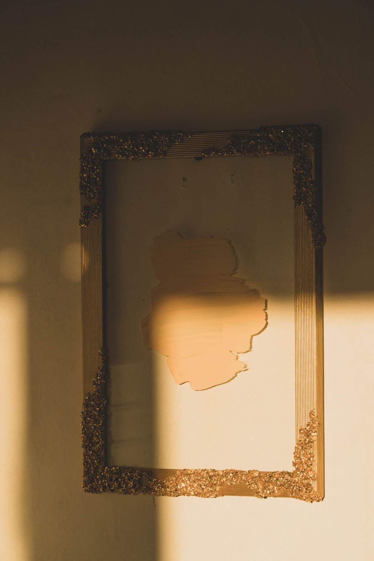
Metallic frames are the smallest family and the loudest. Gold and brass lend ceremony: they warm an image, flatter traditional and vintage subjects, and echo the metals in lamps and hardware so a room feels composed. Their thin profiles keep the ceremony from becoming costume. Silver, chrome, and pewter run cool and spare — the frame of photography shows and modern rooms — and they sharpen black and white work particularly well. With metals, profile matters as much as color: a wide gilt molding is a statement, a hairline brass edge is a whisper, and confusing the two volumes is where metal frames go wrong. Choose the metal your room already speaks, at the volume the picture can carry.
Matching the room, lightly
The reliable method is echo, not match — the same principle that governs wall art color choices for the art itself: pick up a note already in the room rather than copying it. Find one finish already in the room — the floor’s undertone, the lamp metal, the hardware, the leather’s warmth — and let the frame answer it once. A room of warm wood and brass takes wood or brass frames as if they had always been there; a cool room of chrome and gray takes silver or black. Floors deserve a vote because they are the largest surface the picture will live above: a frame family that fights the floor fights it at every glance. What you are avoiding is the showroom effect, where frame, furniture, and floor are the same product in three sizes. One echo is composition; three matches are inventory.
Mixing frame colors on one wall
Mixed frames are allowed — under discipline. The pattern that works is a dominant finish with a supporting one: mostly black with one wood, mostly wood with a single gilt, in rough proportion rather than strict alternation. Keep the profiles similar in width so the frames read as one family with two accents, and keep mats consistent across the group, since a shared mat tone is the strongest glue a mixed wall can have. The pattern that fails is the census: one of everything, each at the same size and spacing, which reads as a frame shop’s sample wall. If a mixed wall feels wrong and you cannot say why, count finishes — three or more at equal weight is almost always the answer.
The mat is half the decision
On paper prints, the color choice is really two choices, because the mat is a frame inside the frame — often the wider of the two, and always the value the image touches directly. A bright white mat freshens and modernizes, an off-white or cream mat warms and traditionalizes, and a dark mat turns the presentation dramatic and gallery-like, at the risk of swallowing a dark image’s edges. A practical consequence follows: a modest frame with the right mat usually outperforms an expensive frame with the wrong one, and changing a mat is the cheapest way to move a picture from one room’s palette to another’s. When a framed piece feels off in a new home, suspect the mat before the frame — it is the color doing the most work and asking the least credit.
How to choose a frame color: decision order
When in doubt, decide in this sequence. First the image: does it need sharpening (black or metal), softening (white), or warming (wood or gold)? Then the wall: light walls forgive everything except pale-on-pale; dark walls demand a frame with its own edge. Then the room: echo one finish that already lives there. Then the group: if the piece joins a wall of others, the wall’s dominant finish gets the final vote. That is how to choose a frame color: frames chosen in that order rarely need returning — and the picture, which was the point all along, gets the last word the frame was hired to give it.
More in Color & Decorating Fundamentals


Continue exploring: Color & Decorating Fundamentals guides · All guides