

Wall Art for Offices: Calmer, Better Rooms
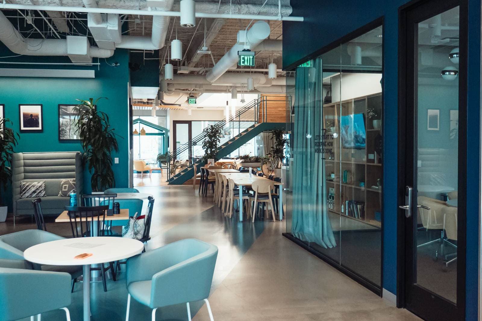
Office walls are read down corridors, through glass, and on video calls. Plan them as one scheme, not as leftover decoration for each room.
Key Takeaways
- Choose subjects for the work nearby: calm landscapes, architecture, and restricted-palette abstracts for meeting rooms, quieter work for focus rooms, and local subjects in reception.
- Use maps as a natural office subject, and ration text-heavy art hard, since slogans read as noise down a corridor.
- Specify for a busy building: wipeable surfaces, corners that tolerate knocks, flush secure fixings, and matte or satin finishes that do not turn glare into a mirror.
- Plan across floors with a shared palette, a subject family per floor or department, and one large anchor per long sightline, with a written record of subject, size, finish, and location.
- Phase the rollout from the client's path outward, keep supplier references for reprints, and do not leave staff rooms with leftovers - break rooms get some of the most lookable art.
Office art fails in two directions. The first is the motivational poster, shouting at people who did not ask to be shouted at. The second is the blank corridor, which tells clients and staff alike that nobody thought about this place at all. Good wall art for offices sits between those failures: subjects chosen for the work that happens near them, formats that survive a busy building, and a plan that treats a whole floor — or several — as one scheme rather than a series of accidents.
Wall art for offices: subjects that suit focus and clients
Different rooms do different work, and their art should be chosen accordingly. Meeting rooms need pictures that support other people’s thinking: calm landscapes, architecture, and abstracts with a restricted palette all give a room presence without competing with the screen or the conversation. Focus rooms and individual offices take quieter, more personal work. Client-facing spaces — reception above all — carry the firm’s character, which is why local subjects do so well there: a client reads a wall of the firm’s own city or region as confidence, not decoration.
Text-heavy art is the one category to ration hard. A single typographic piece can be a deliberate statement in a lobby. Read down a corridor, slogans become noise, and noise is the opposite of the calm an office wall should be selling.
Maps: the office’s native art
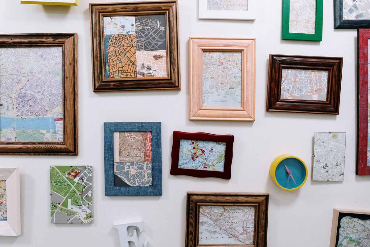
If one subject was made for offices, it is the map. Maps are handsome, neutral, endlessly lookable, and quietly intelligent — exactly the register a professional room wants. A large map of the firm’s city in reception gives waiting clients something genuinely interesting to study. Maps of the regions a firm serves make a corridor tell the company’s story without a word of copy. Historical maps add the one thing new offices lack: a sense of having been somewhere.
Formats that survive a busy building
Corridors are impact zones. Frames get knocked by carts, chairs, and moving furniture, and cleaning crews wipe first and ask later. Specify accordingly: surfaces that can be wiped clean, corners that tolerate a knock, and fixings that hold a piece flush and firm rather than hanging it from a single hook where it will drift crooked within the month. Flush, secure mounting is also the honest answer to the corridor’s other problem — art in public areas should be removable by the facilities team, not by anyone passing with a free afternoon. The same specification logic, pushed harder, runs through art for hotels and rentals, where rooms turn over weekly rather than yearly.
Glare deserves a line in the specification. Corridors and meeting rooms are full of downlights and glass, and a glossy surface under them becomes a mirror with a picture behind it. Matte and satin finishes earn their keep in commercial spaces in a way they never have to at home.
Wall art for offices, planned across floors
The difference between an office that looks art-directed and one that looks accumulated is a plan. A workable one has three parts. First, a palette discipline: a small set of tones the whole scheme draws from, so floors feel related even when subjects differ. Second, a zone logic: each floor or department gets a subject family — one floor’s landscapes, another’s architecture — which quietly helps people navigate and gives each area an identity staff actually use (“meet me by the harbor pictures” is real wayfinding). Third, a record: sizes, subjects, and locations written down, so replacing a damaged piece or extending the scheme next year is a lookup, not an archaeology project.
Buy the record-keeping habit before you buy the art. It is the cheapest part of the scheme and the one that makes every later decision — refresh, replacement, a second office — straightforward.
Sizing for corridors and glass
Office art is read at distances homes never ask for: down a thirty-foot corridor, across an atrium, through a glass wall from the elevator lobby. Size for the longest intended view. A piece that reads perfectly from a desk chair is a postage stamp at the end of a hallway, so corridor schemes should think in one large anchor per sightline — the image that resolves as you approach — with any smaller pieces working as near-range detail at doorways and seating nooks, where people actually stop. Between anchors, empty wall is not failure: a corridor that breathes reads as confidence, and it makes the anchors legible as decisions rather than wallpaper.
Glass-walled rooms add the reverse view: the picture is seen from behind, through glass, as often as from its own side. That argues for tidy backs, no visible hanging hardware, and flush mounts — the scheme should look deliberate from every angle the building offers, because the building will offer all of them.
Identity without the logo wall
Every firm wants its space to say who it is, and the clumsy way is the logo repeated until it becomes invisible. The better way is subject and palette: the region the firm serves, the materials it works in, the era of the building, a signature color carried quietly through the frames and mounts. A shipping firm’s walls of harbors and chart art, a law firm’s historical maps and architecture, a studio’s bold abstracts in its own brand palette — each tells a visitor more in ten seconds than a vinyl logo at reception, and none of it dates when the brand refreshes.
Phasing, records, and the second office
Few firms art a whole building in one pass, and they do not need to. A sane rollout starts with the client’s path — lobby, lift hall, meeting floor — then the corridors staff live in, then focus rooms last, when the scheme’s palette is proven and stragglers can be chosen against it. What makes phasing work is the record started on day one: every piece logged with subject, size, finish, and location, plus the supplier’s references for each image. With that file, phase two is a purchase order, a damaged piece is a reprint, and the second office opening across town inherits a scheme instead of starting a new argument.
The record also protects the budget conversation. When leadership asks what the walls cost and what they are doing, the answer is a document — pieces, placement, replacement plan — rather than a shrug toward the corridor. Walls planned like assets get maintained like assets; walls bought as decoration get forgotten like decoration.
The rooms staff actually live in
Client routes get the budget first, but do not let the scheme stop at the corridor the clients never leave. Break rooms, kitchens, and the long internal hallways are where staff actually spend their unscripted minutes, and their walls get read the most closely of all — at close range, daily, for years. That argues for the most lookable art in the building, not the leftovers: detailed maps, rich landscapes, pieces that repay the hundredth viewing. A firm that hangs its best work where its own people eat has said something true about itself, and staff are perfectly capable of noticing which version of the scheme they got.
Video calls have quietly made one more wall strategic: the backdrop behind senior people. A calm, subject-led piece — landscape, map, architecture — reads on camera as competence and stays out of the conversation, which is precisely the job. Busy patterns moiré on camera and loud art upstages the speaker; test any backdrop the way it will actually be seen, in the call window, before it is screwed to the wall behind the managing partner.
Working with a supplier
Whether you furnish one office or a portfolio, the questions to ask a print supplier are the same ones a designer asks on any project — the questions our wall art for interior designers guide puts to any print partner before a client’s money is committed: What are the trade terms, and what do they actually require? What are the real lead times at the sizes you need, in writing? How are proofs handled before a large run? What happens when a piece arrives damaged, or a corridor eats one in year two — can the exact piece be reprinted to match? A structured trade program exists to make those answers boring and predictable; if a supplier cannot give them plainly, that is information too.
And do not neglect the office’s second home: the home office walls behind your people on video calls. A consistent, calm background there is the same decision, at household scale; our guide to home office wall art covers backdrop placement and glare control for the room itself. Offices are read by their walls more than by their furniture. Choose wall art for offices the same way: subjects for the work, formats for the building, a plan for the whole floor — the calm is what people will remember.
More in Trade & Designer B2B

Continue exploring: Trade & Designer B2B guides · All guides